The Kofe Club is a proudly African brand starting with a cafe shop in Lagos, hoping to spread to other African cities. The deal is to create a well-designed space that modern Lagosians can come, really feel at home, have meetings, read a book, drink coffee, in the midst of knowing a little more about the heritage of African coffee. From made in Nigeria Afro-minimalist furniture to locally produced coffee, the brand is gunning for a proudly African persona that isn’t contrived or pretentious. The brand is simply driven by a sense of heritage but without compromise on contemporary reality.
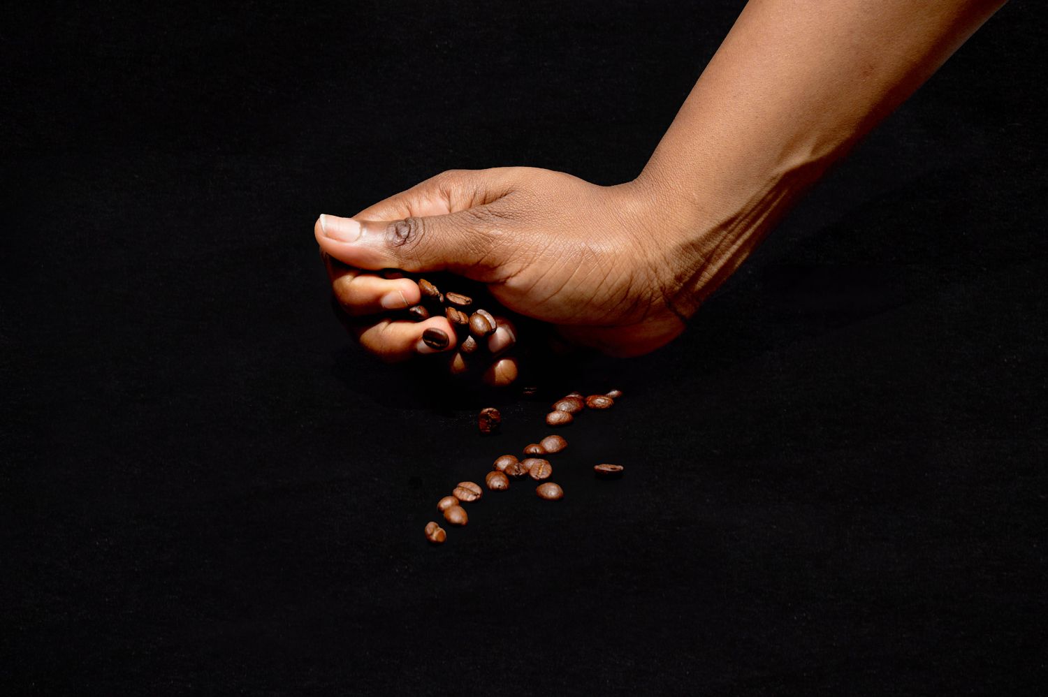
Africa is a big place with diverse cultures. To create an effective brand identity for a cafe that aims to connect on a "feel at home," "belong to a club" vibe, there needs to be localized concepts. What is local is familiar and familiarity makes one feel at home. With local as opposed to the vagueness of African, the design can be more contextual to a certain locality. Hence we came up with the concept statement "Drink, Know & Feel Local" Drink homegrown, locally processed coffee, Feel the relaxed ambiance provided by locally made Afro-minimalist furniture and Know a little more about African coffee heritage.
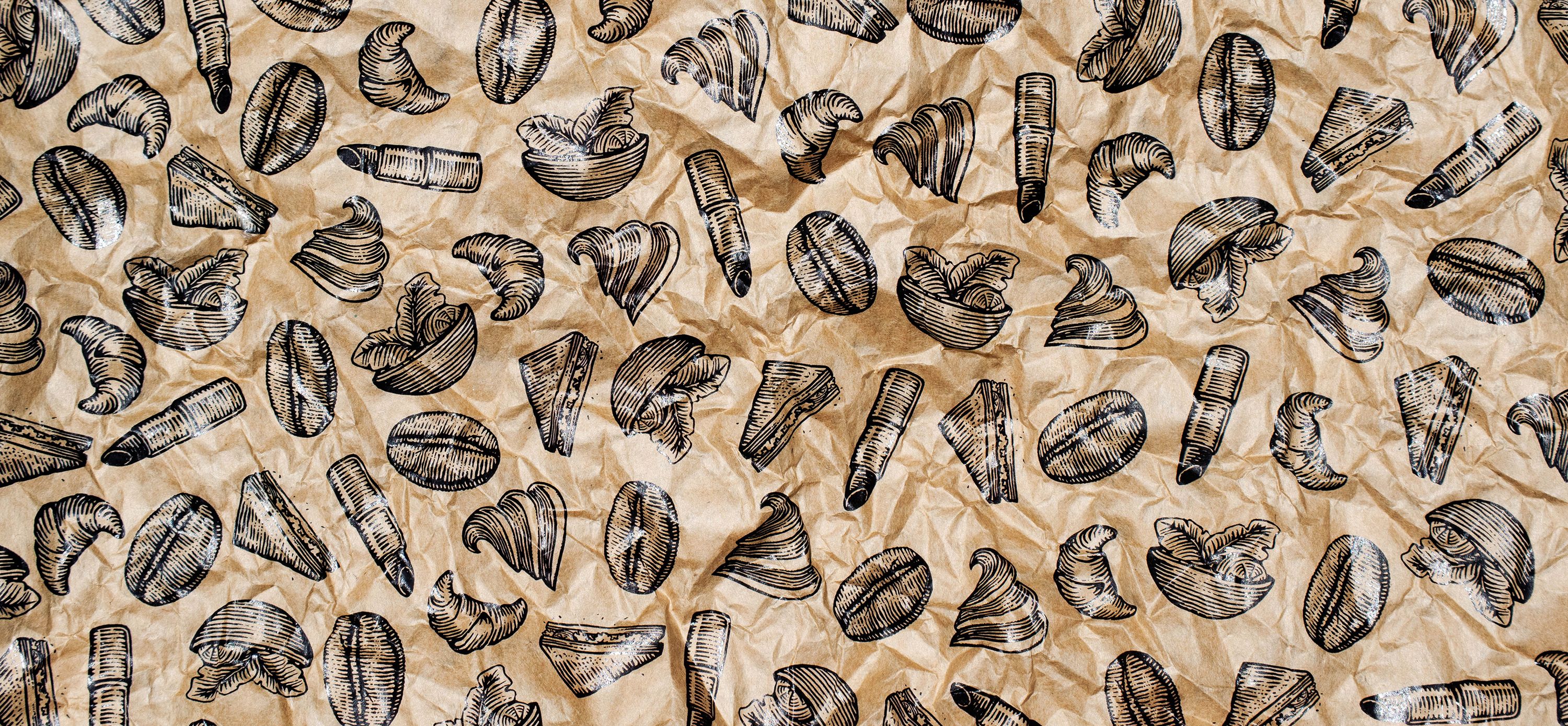
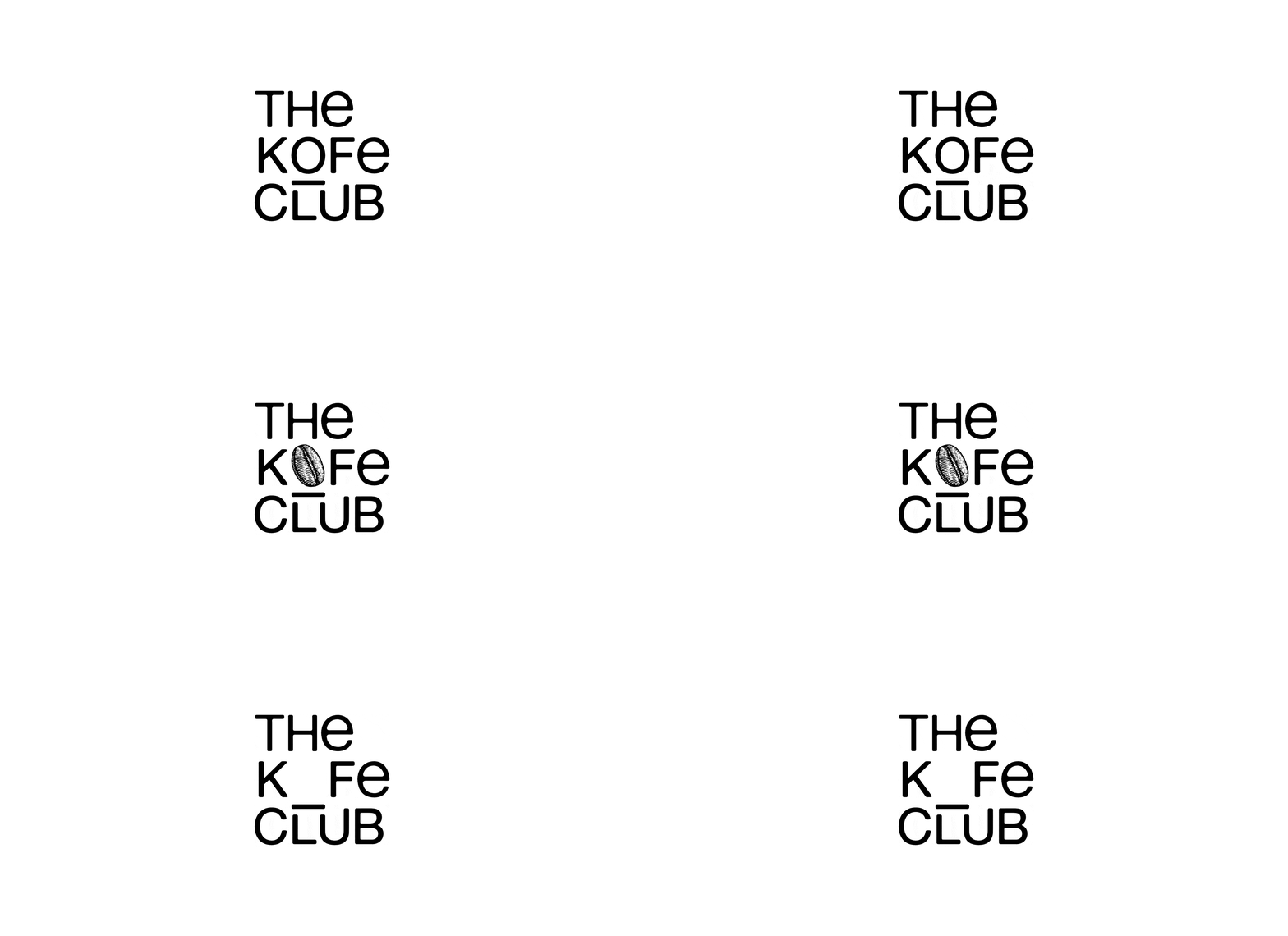
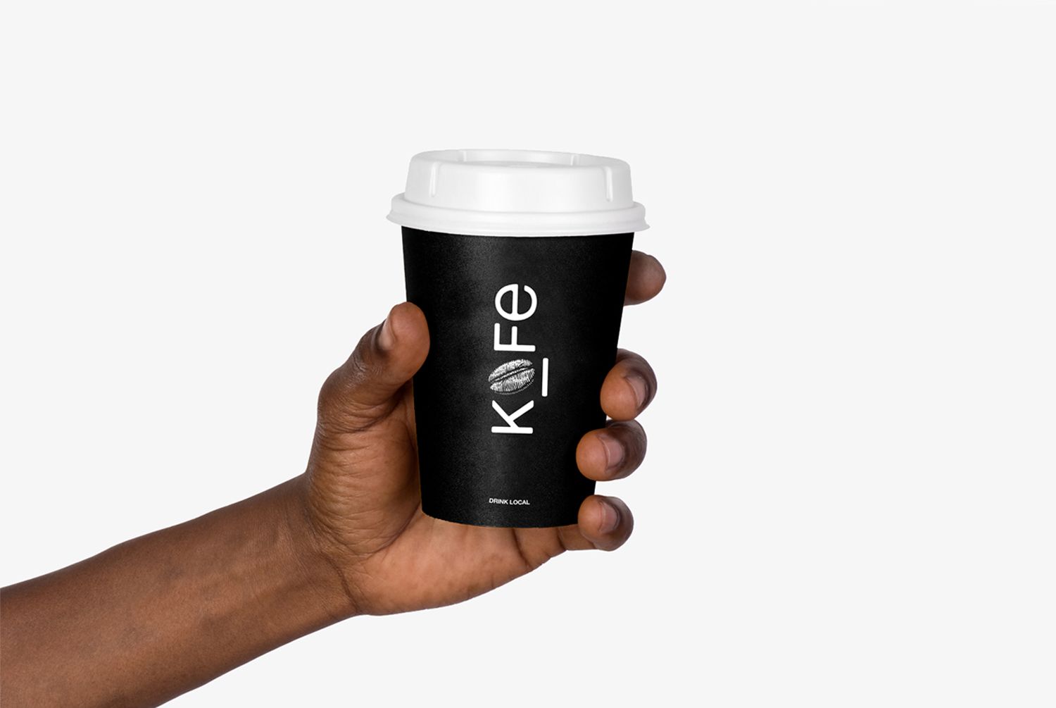
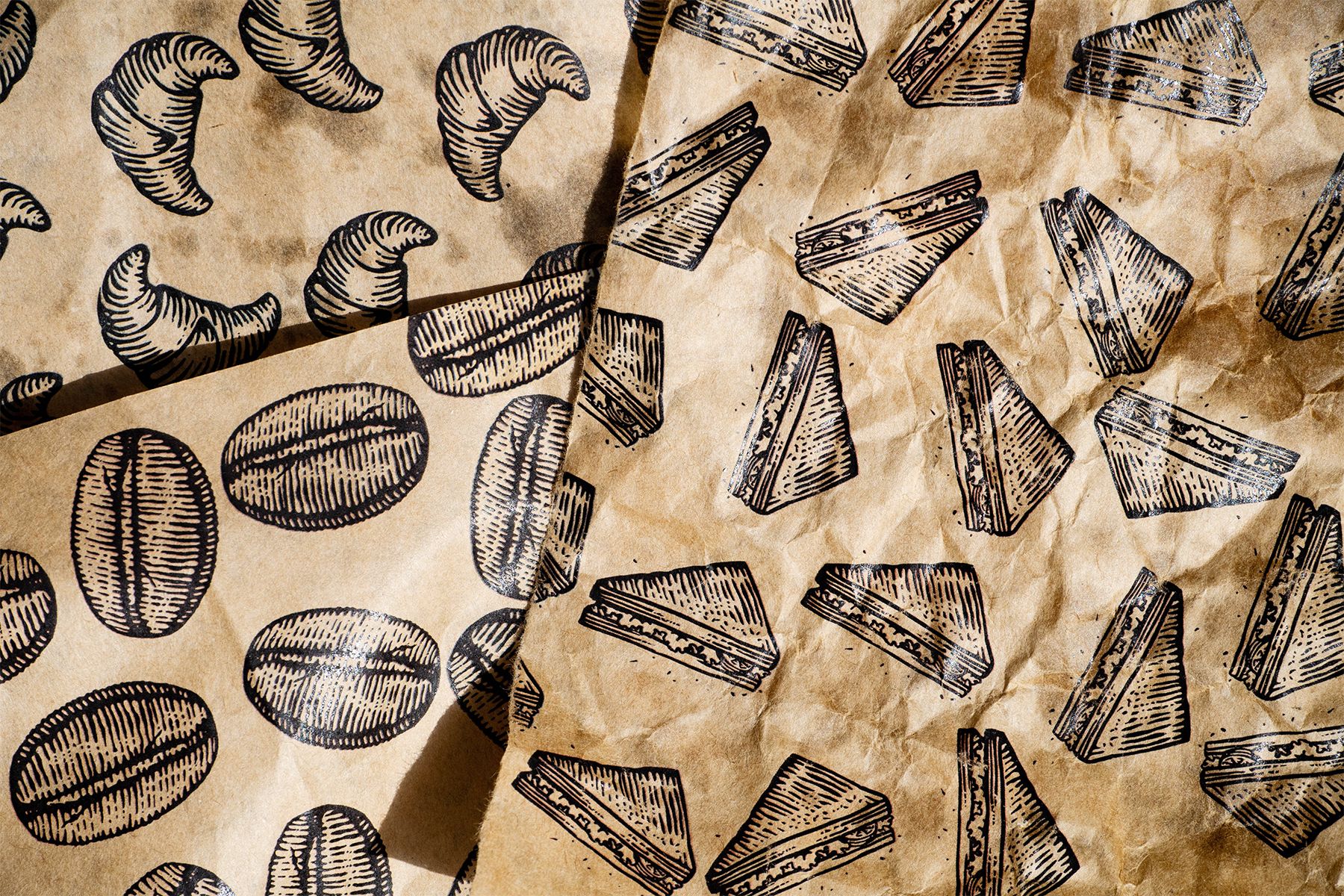
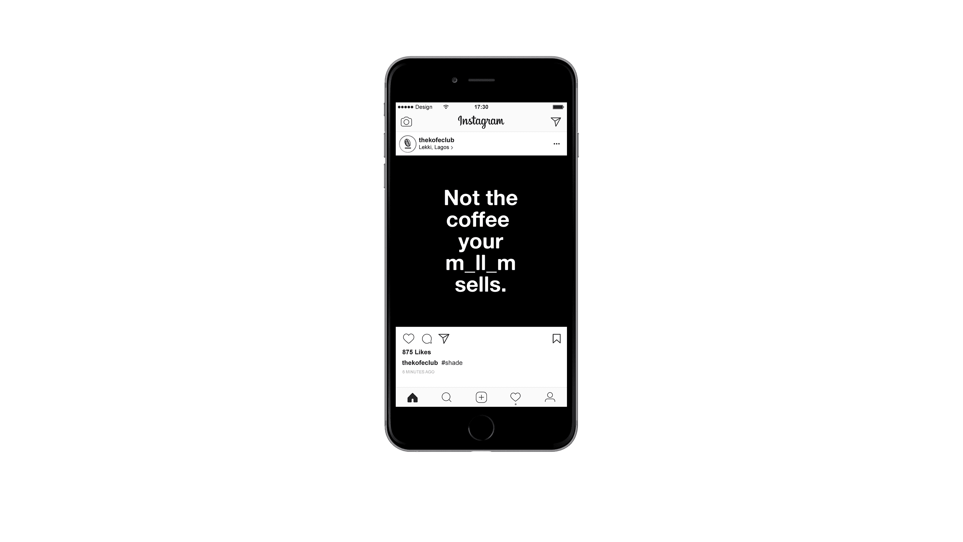
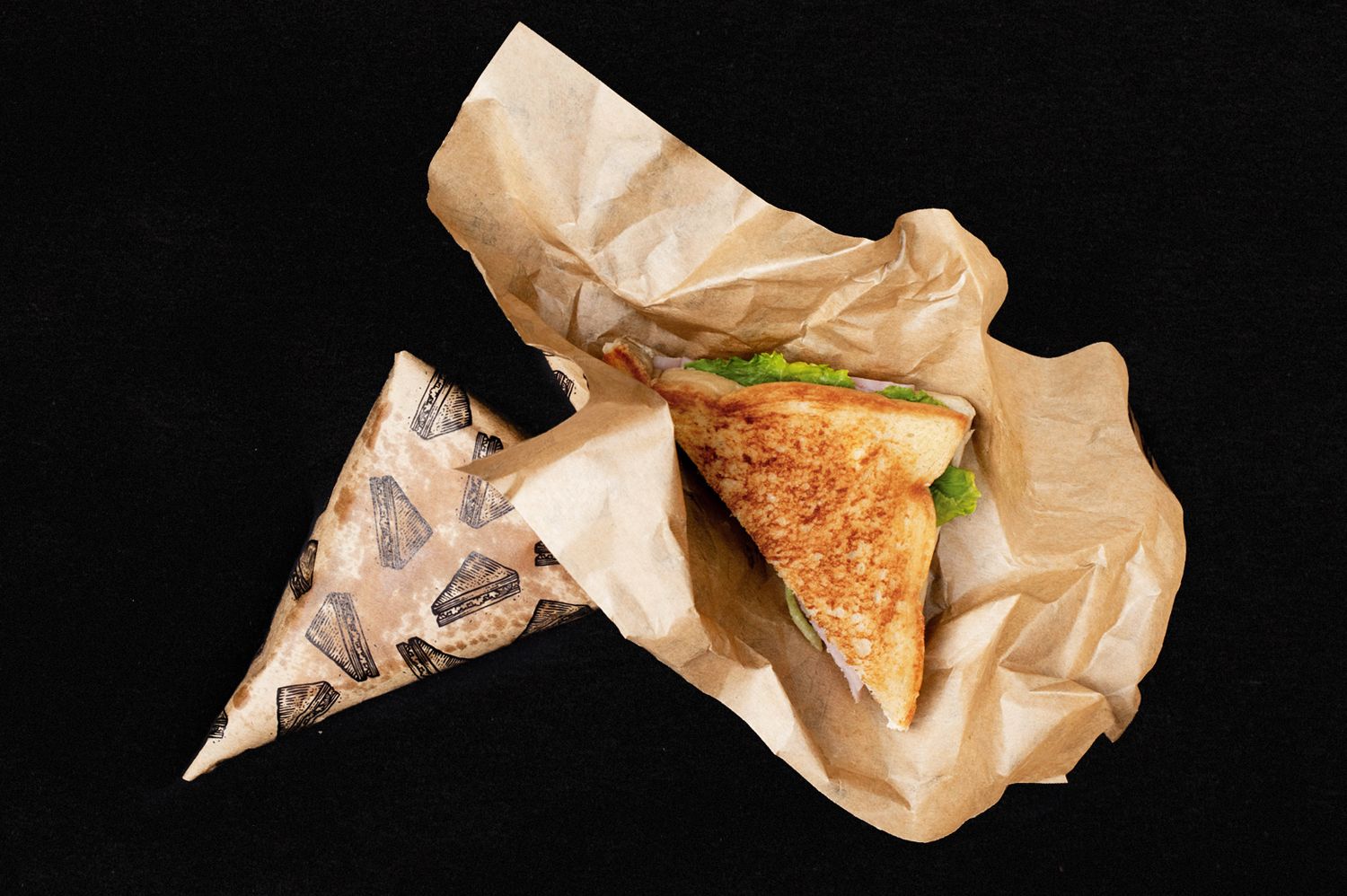
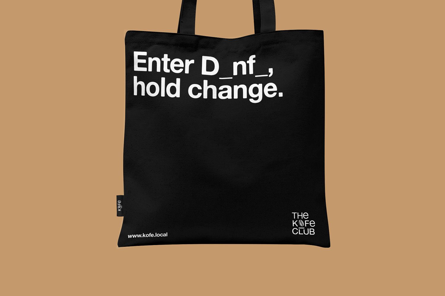
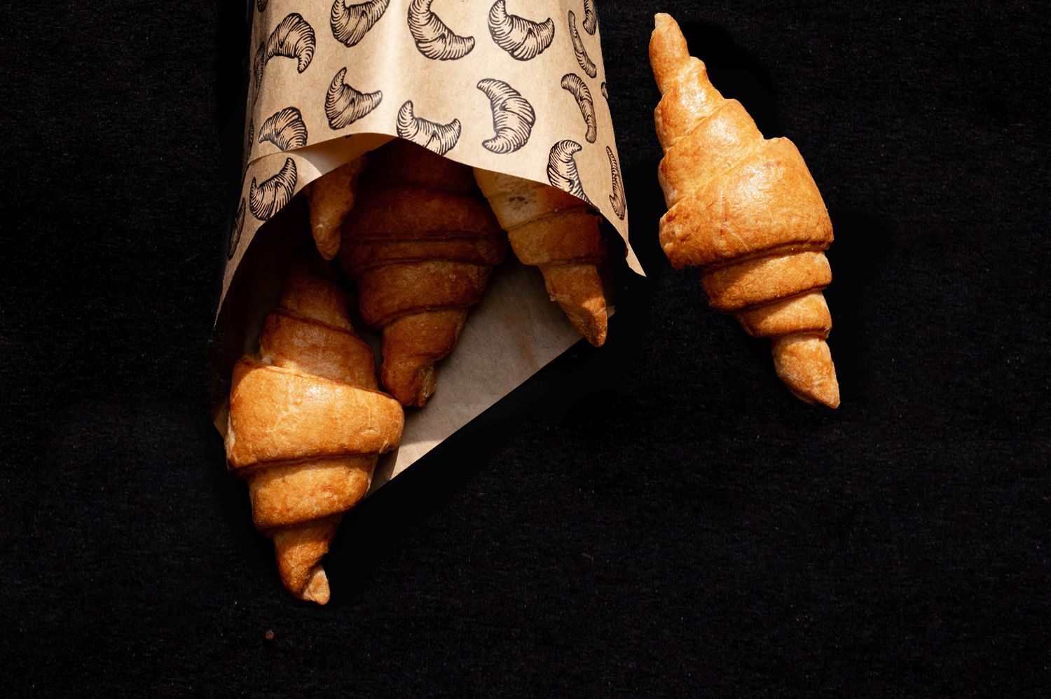
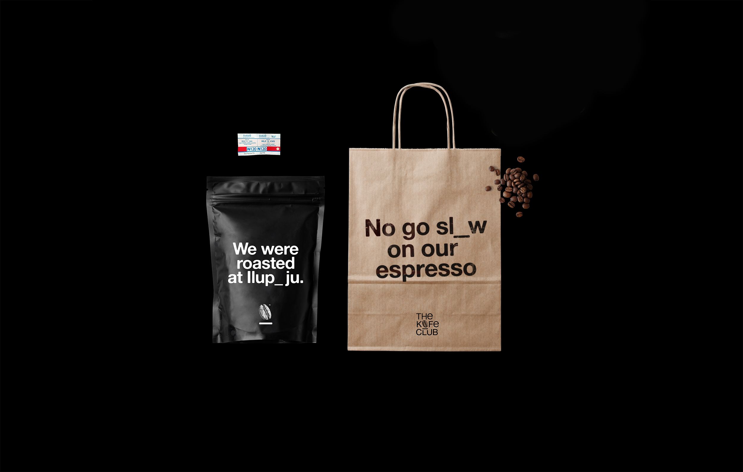
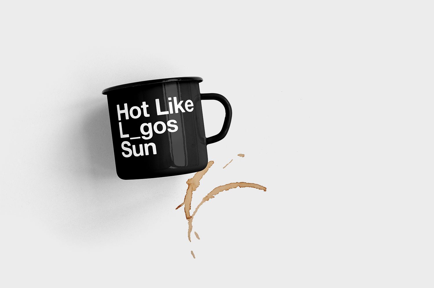
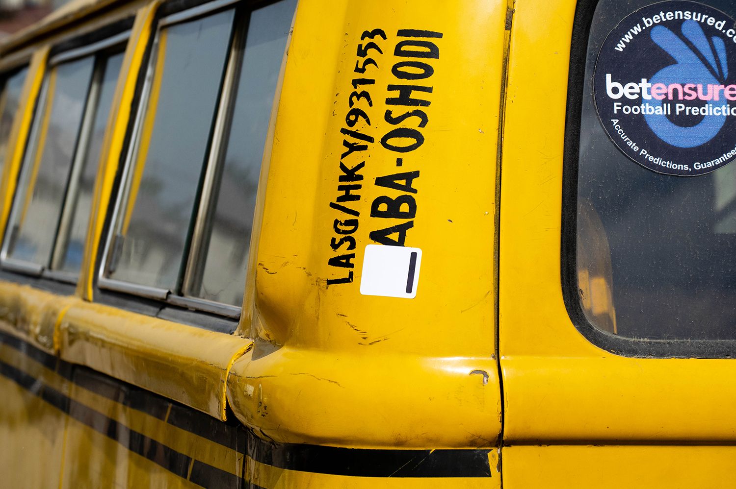
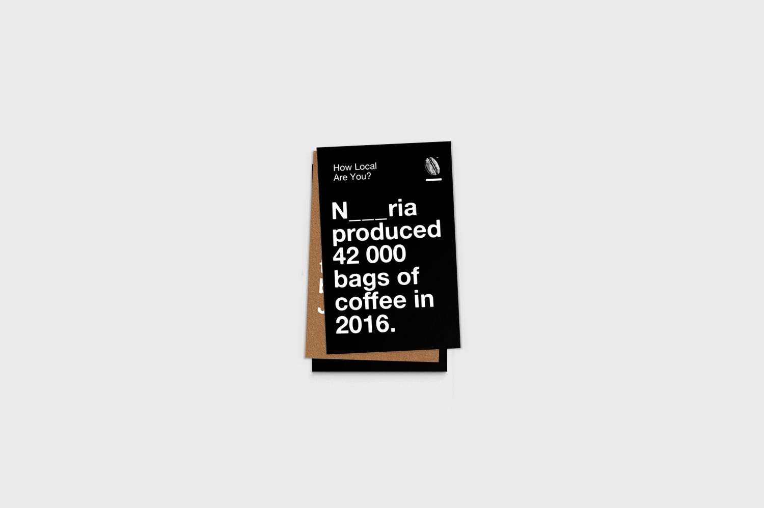
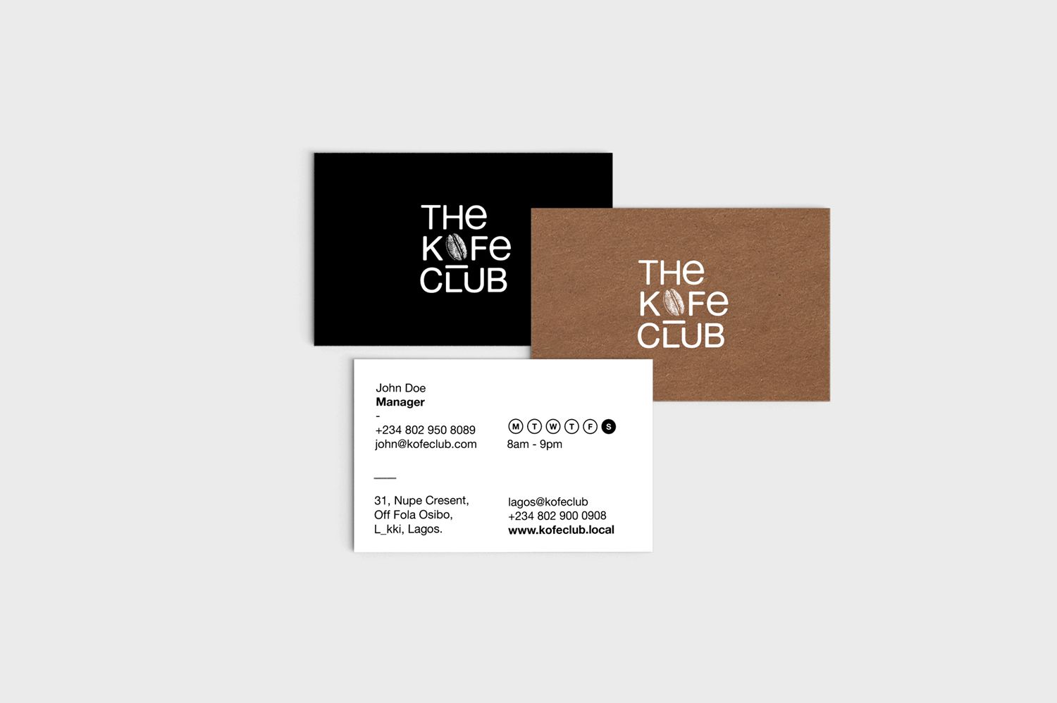
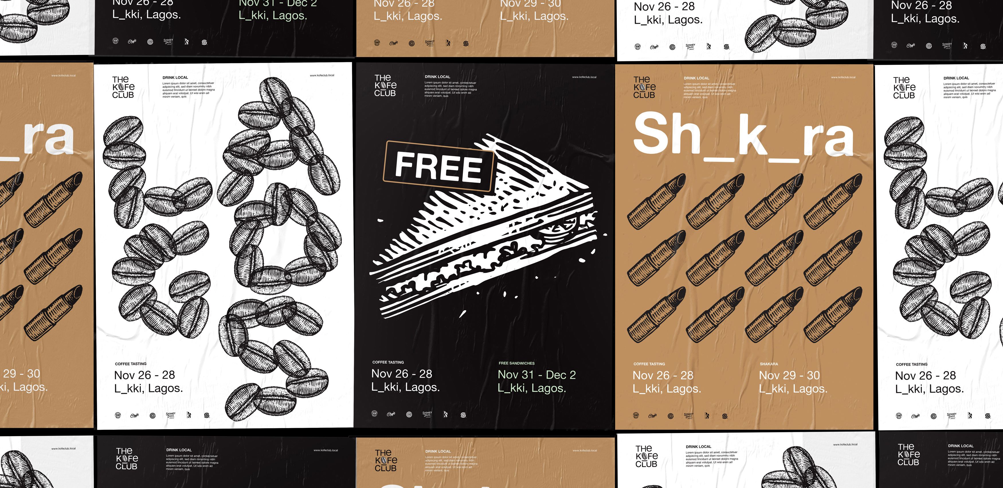
Drinking local is inevitable, after all the coffee is produced here in Ilupeju. Knowing local and feeling local were the trickier aspects yet also where we could heighten the experience of drinking local. How do we translate the spirit and feeling of being in the cafe to a tote bag or a business card? "know local" had the answer. Being in the know of local pop culture, lifestyle and history, makes you feel like part of the local culture. When you know local, you feel local. This led us to the exploration of the fill in the blank visual device. By taking out letters from local words, It harnesses the relaxing childlike cheekiness of guessing to connect with the audience. This was also a seamless approach to allow the brand remain educative without seeming academic. Although starting with Lagos, this solution could work in any other African city. Supported with woodcut-style illustrations very reminiscent of local craftsmanship to resonate the finesse and craft involved in coffee making, the visual identity resonates a confident African presence, strays away from cliches like tribal patterns and ultimately engages its audience.
The Kofe Club is a proudly African brand starting with a cafe shop in Lagos, hoping to spread to other African cities. The deal is to create a well-designed space that modern Lagosians can come, really feel at home, have meetings, read a book, drink coffee, in the midst of knowing a little more about the heritage of African coffee. From made in Nigeria Afro-minimalist furniture to locally produced coffee, the brand is gunning for a proudly African persona that isn’t contrived or pretentious. The brand is simply driven by a sense of heritage but without compromise on contemporary reality.
Africa is a big place with diverse cultures. To create an effective brand identity for a cafe that aims to connect on a "feel at home," "belong to a club" vibe, there needs to be localized concepts. What is local is familiar and familiarity makes one feel at home. With local as opposed to the vagueness of African, the design can be more contextual to a certain locality. Hence we came up with the concept statement "Drink, Know & Feel Local" Drink homegrown, locally processed coffee, Feel the relaxed ambiance provided by locally made Afro-minimalist furniture and Know a little more about African coffee heritage.
Drinking local is inevitable after all the coffee is produced here in Ilupeju. Knowing local and feeling local were the trickier aspects yet also where we could heighten the experience of drinking local. How do we translate the spirit and feeling of being in the cafe to a tote bag or a business card? "know local" had the answer. Being in the know of local pop culture, lifestyle, and history, makes you feel like part of the local culture. When you know local, you feel local. This led us to the exploration of the fill in the blank visual device. By taking out letters from local words, It harnesses the relaxing childlike cheekiness of guessing to connect with the audience. This was also a seamless approach to allow the brand to remain educative without seeming academic. Although starting with Lagos, this solution could work in any other African city. Supported with woodcut-style illustrations very reminiscent of local craftsmanship to resonate the finesse and craft involved in coffee making, the visual identity resonates a confident African presence, strays away from cliches like tribal patterns and ultimately engages its audience.
