Cowrywise wants to make saving and investing simple and highly rewarding for everyone, particularly young Africans. The goal of the brand revamp was to express this simple want with utmost clarity, target the brand pain points, and strengthen the brand position. In many regards, the brand was already strong, so there were extensive conversations with the Cowrywise team to understand the company goals. Additionally, a survey with over 500 participants was carried out to validate strengths and identify weaknesses.
The result of the conversations and survey revealed that design was a huge selling point for the brand. It also revealed that the audience needed to be better informed about product offerings and that Cowrywise’s core message – making the workings of building wealth simple and relatable – needed even more clarity. The questions became: how do we create a design language that’s much clearer and impactful without straying too far from what the audience had come to fall in love with? How do we create a brand identity that genuinely represents a company that simply wants to help its audience make money make sense? How do we artfully do this without appearing flippant, childish, or gimmicky?
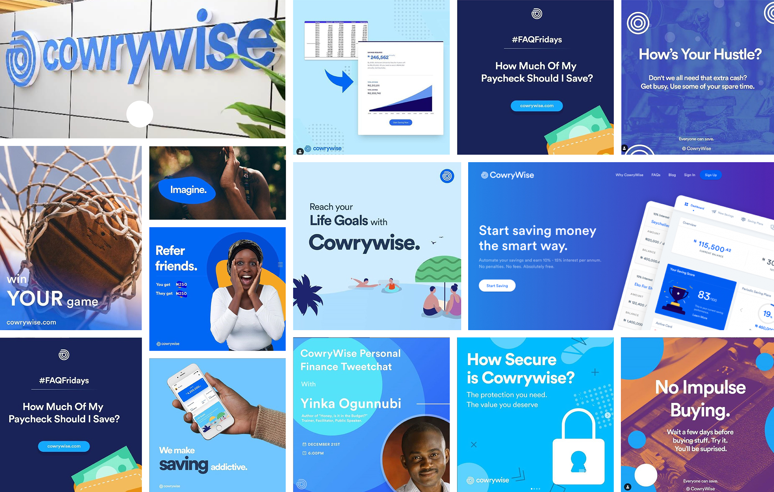
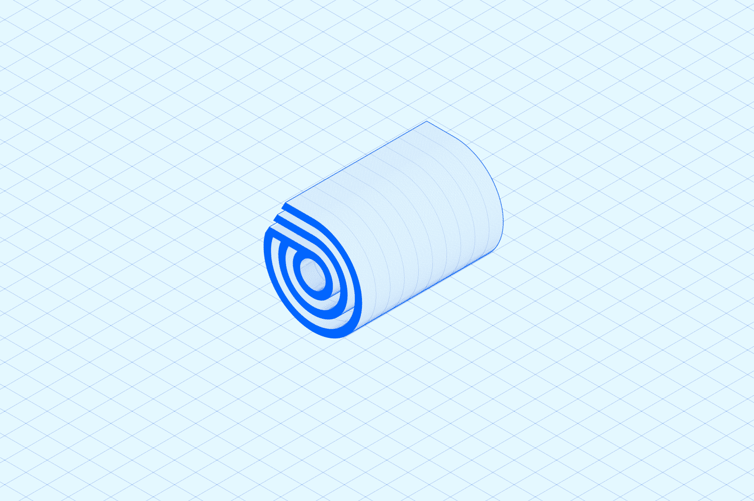
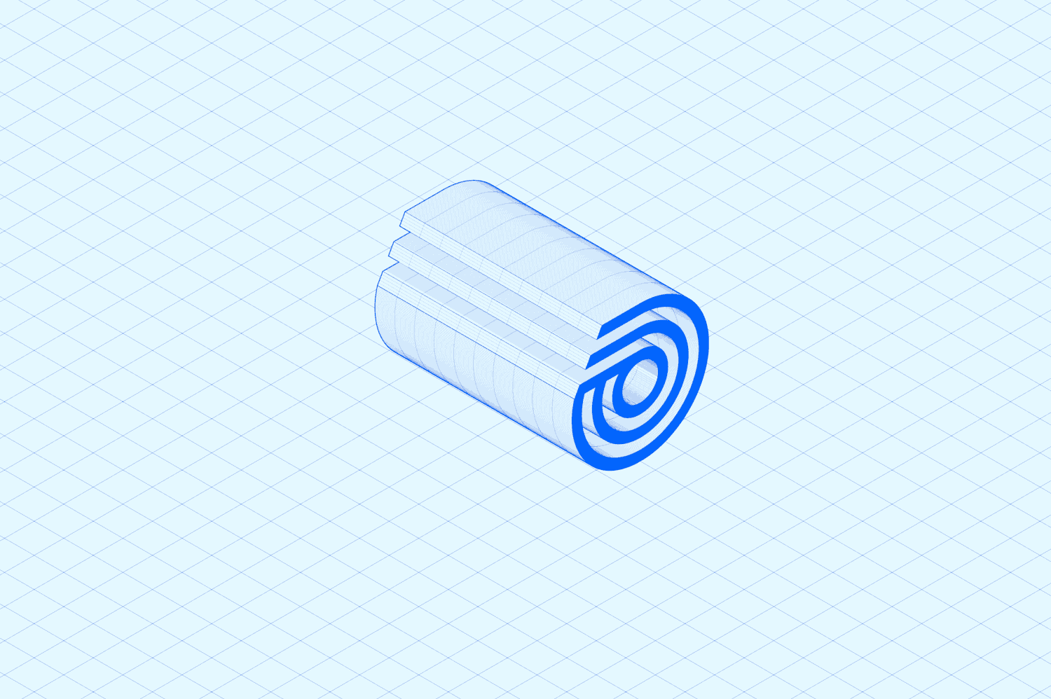
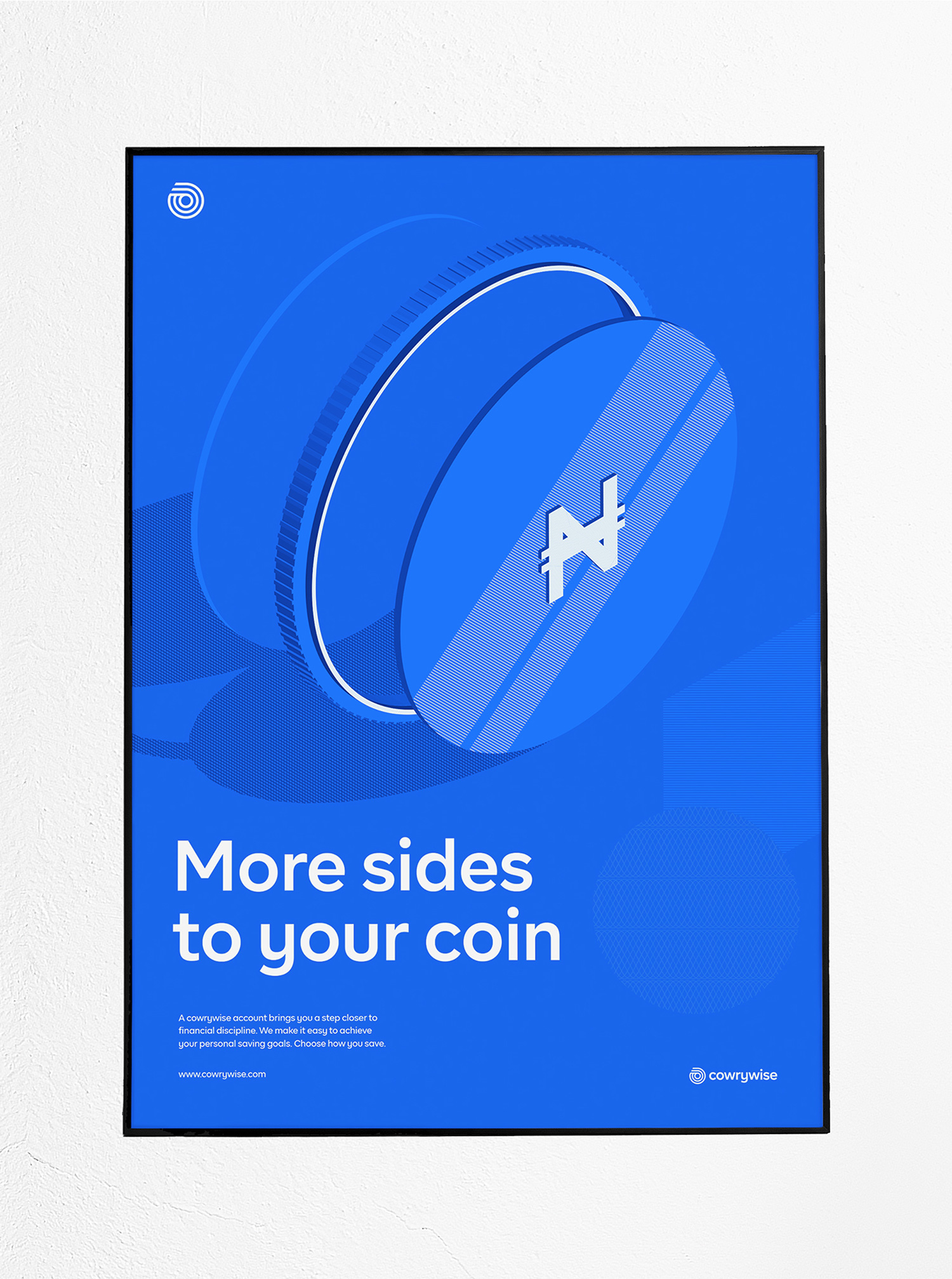
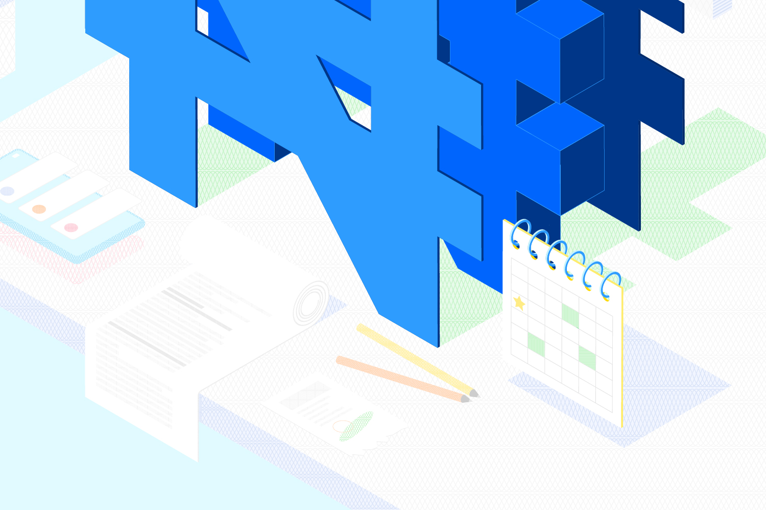
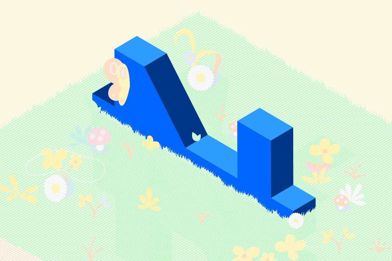
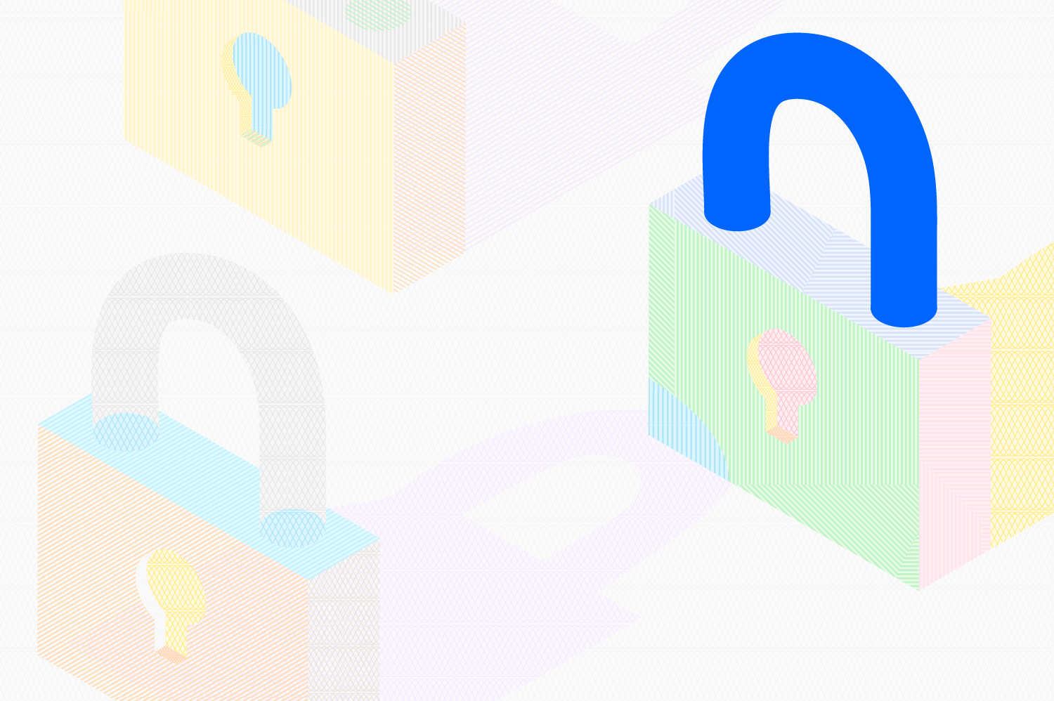
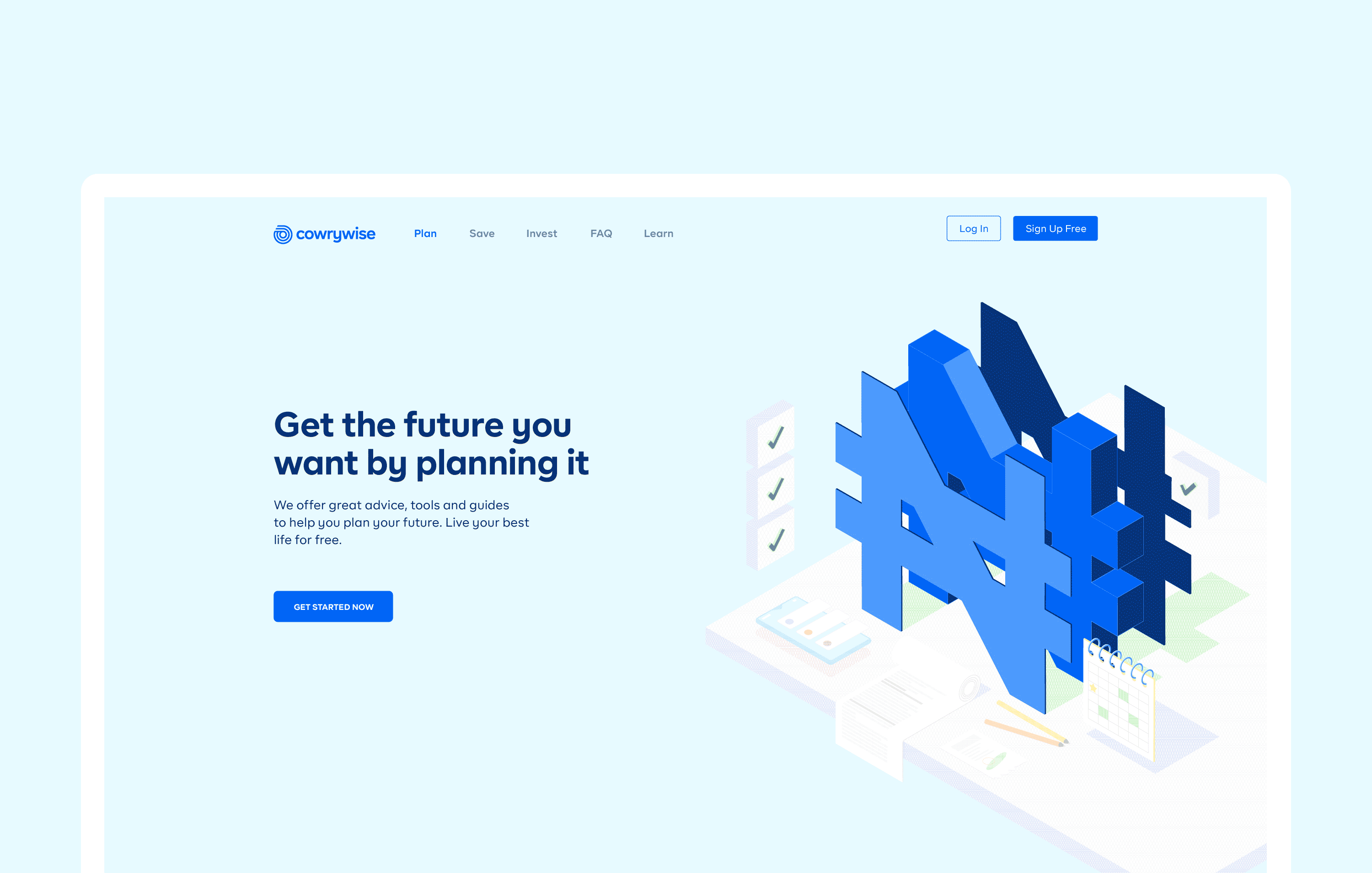
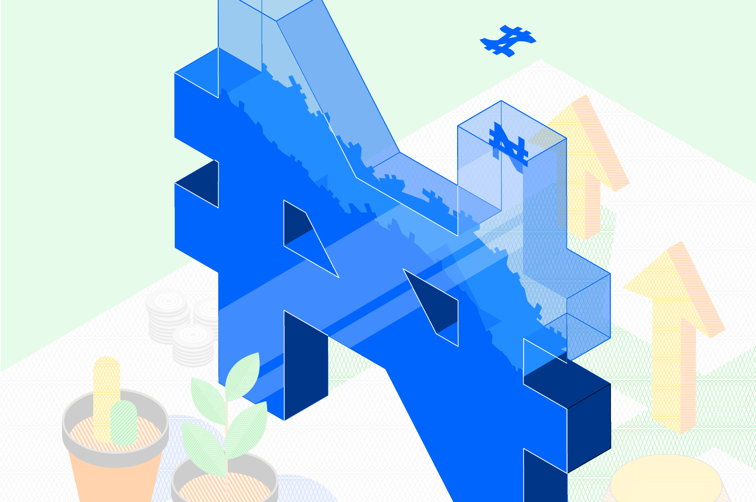
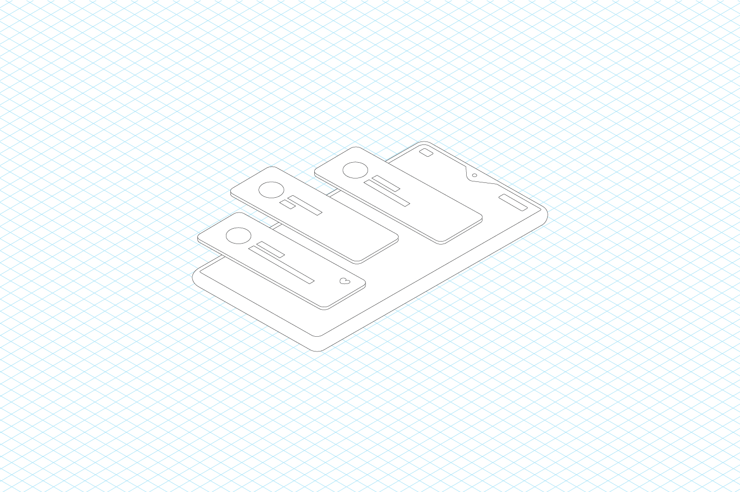
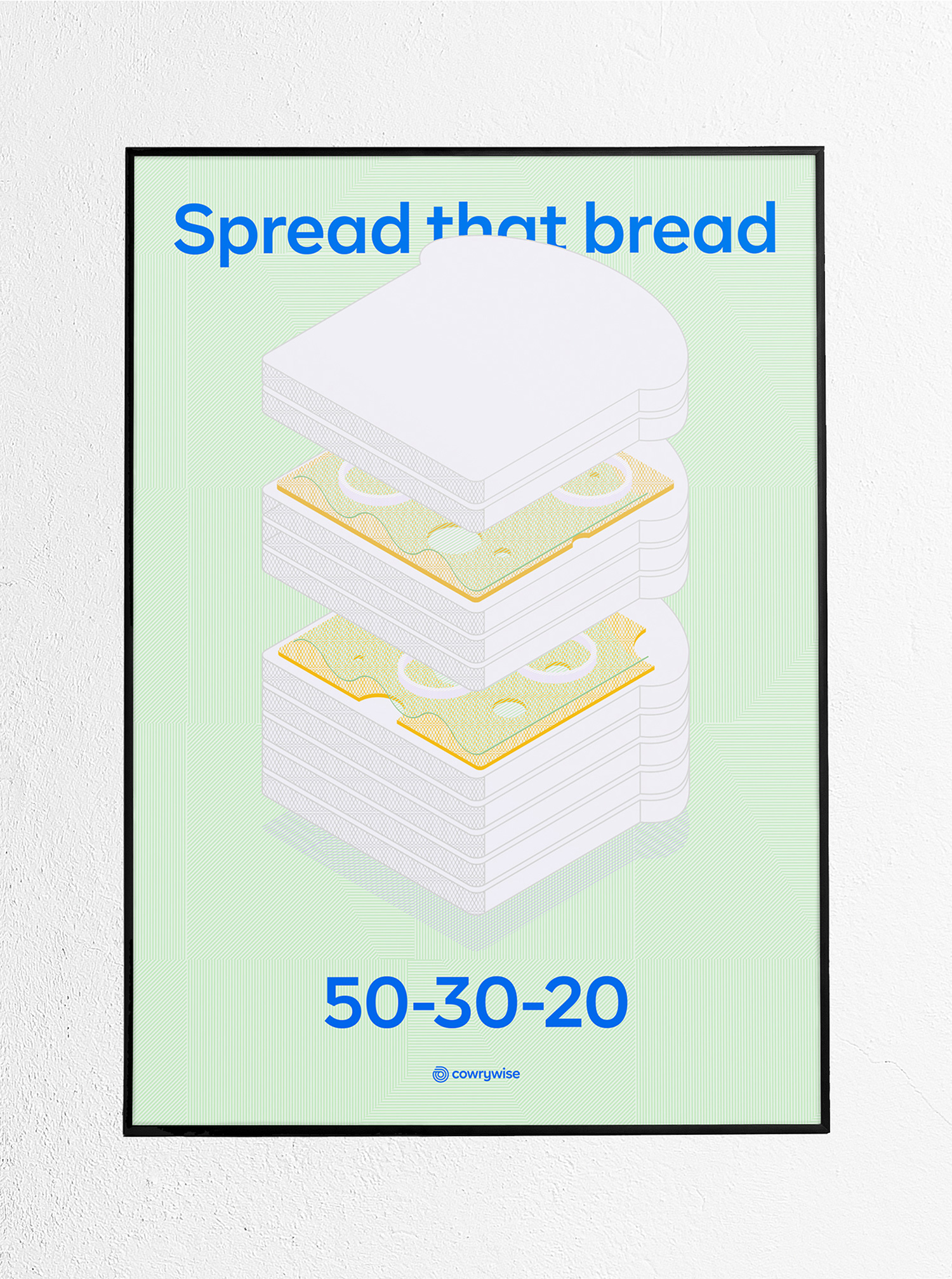
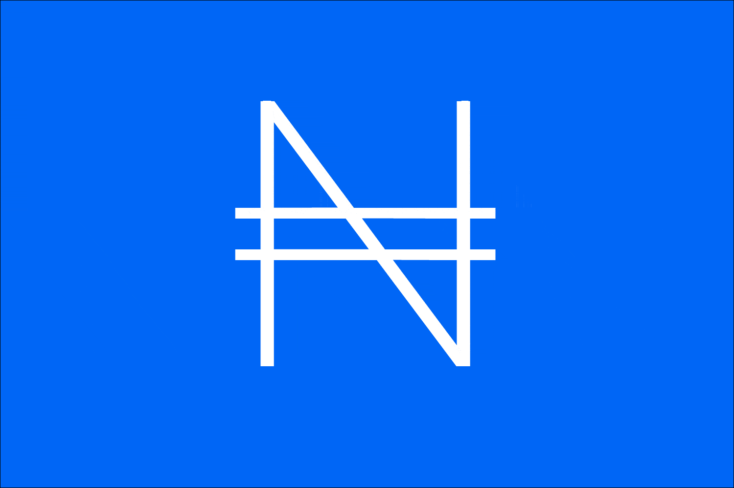
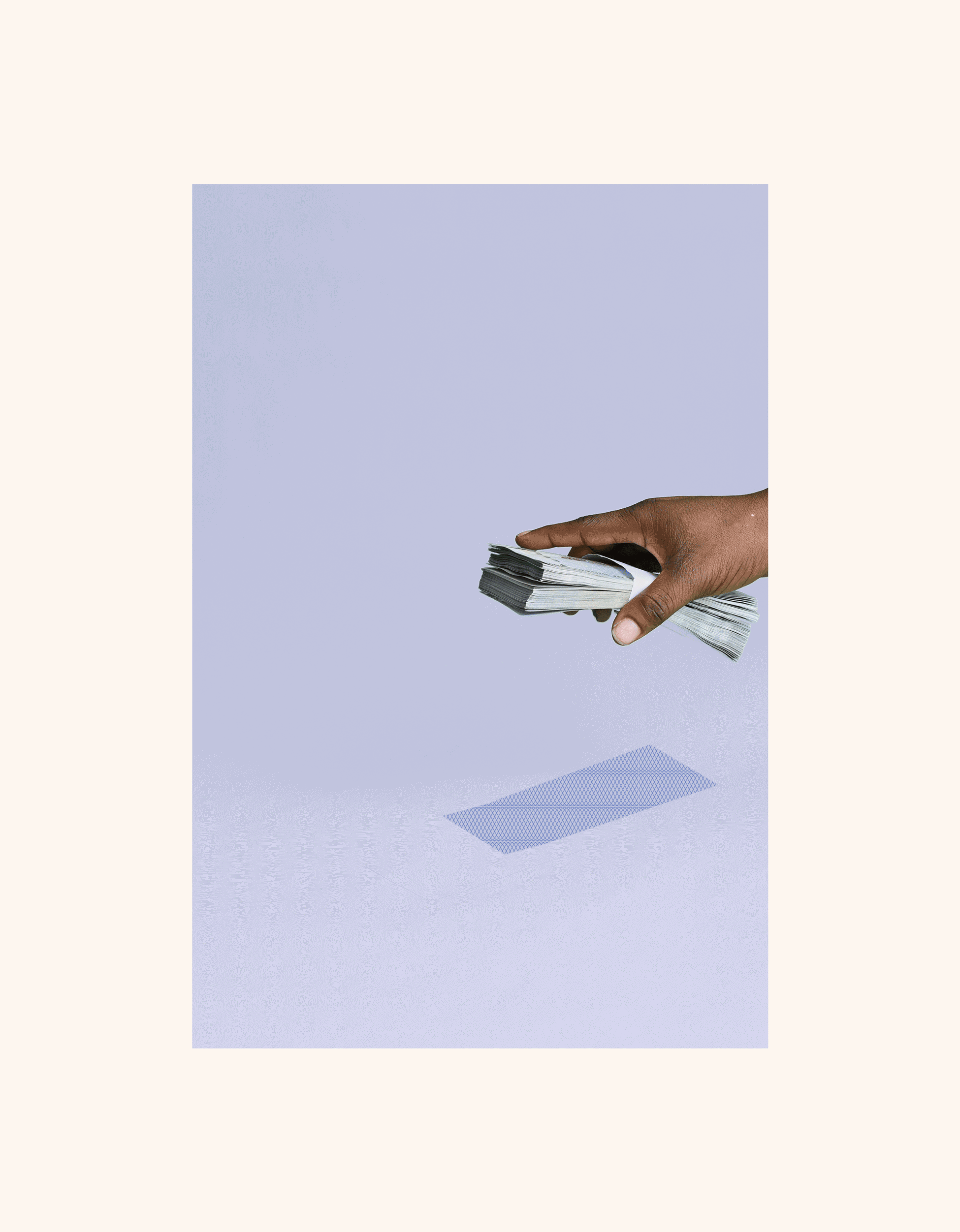
To answer our questions, we made some strategic choices. Firstly, we chose to retain the main brand colour – tweaking it just a little – and add a few supplementary colours so the overall scheme is stronger, more consistent, and distinct. We also chose to keep the Logomark but to give it a whole new meaning and added impact. The logo is now a beautiful, simple rendition of the side view of a wad of cash, not a cowry or shell-like it once was. A wad of cash is something you can touch, feel, hold, and spend. Rolled up, it is a very casual, tangible, accessible looking thing, yet, in the Logomark the wad settles on its structured geometric side view. This is a great metaphor of how a structured, well-equipped company like Cowrywise is offering that structure to its audience in a way that feels accessible, casual, relatable, and tangible, without compromising on reliability. The Logomark doesn’t shy away from representing money in the way most people have come to fall in love with money itself, but not without the side of financial wisdom and discipline that Cowrywise also represents. To extend this idea even further, the verbal identity was updated to also not shy away from being direct and replacing the word "finance" with "money". New identity devices like a more distinct Wordmark, a 3D language – which basically says we look at things from all sides – and the colourful guilloche inspired patterns – which seamlessly ties everything together – combined to amplify Cowrywise’s core message.
Cowrywise wants to make saving and investing simple and highly rewarding for everyone, particularly young Africans. The goal of the brand revamp was to express this simple want with utmost clarity, target the brand pain points, and strengthen the brand position. In many regards, the brand was already strong, so there were extensive conversations with the Cowrywise team to understand the company goals. Additionally, a survey with over 500 participants was carried out to validate strengths and identify weaknesses.
The result of the conversations and survey revealed that design was a huge selling point for the brand. It also revealed that the audience needed to be better informed about product offerings and that Cowrywise’s core message – making the workings of building wealth simple and relatable – needed even more clarity. The questions became: how do we create a design language that’s much clearer and impactful without straying too far from what the audience had come to fall in love with? How do we create a brand identity that genuinely represents a company that simply wants to help its audience make money make sense? How do we artfully do this without appearing flippant, childish, or gimmicky?
To answer our questions, we made some strategic choices. Firstly, we chose to retain the main brand colour – tweaking it just a little – and add a few supplementary colours so the overall scheme is stronger, more consistent, and distinct. We also chose to keep the Logomark but to give it a whole new meaning and added impact. The logo is now a beautiful, simple rendition of the side view of a wad of cash, not a cowry or shell-like it once was. A wad of cash is something you can touch, feel, hold, and spend. Rolled up, it is a very casual, tangible, accessible looking thing, yet, in the Logomark the wad settles on its structured geometric side view. This is a great metaphor of how a structured, well-equipped company like Cowrywise is offering that structure to its audience in a way that feels accessible, casual, relatable, and tangible, without compromising on reliability. The Logomark doesn’t shy away from representing money in the way most people have come to fall in love with money itself, but not without the side of financial wisdom and discipline that Cowrywise also represents. To extend this idea even further, the verbal identity was updated to also not shy away from being direct and replacing the word "finance" with "money". New identity devices like a more distinct Wordmark, a 3D language – which basically says we look at things from all sides – and the colourful guilloche inspired patterns – which seamlessly ties everything together – combined to amplify Cowrywise’s core message.