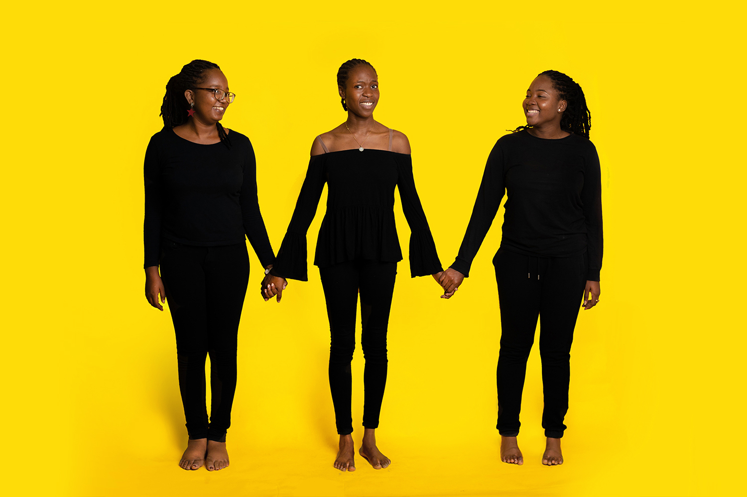
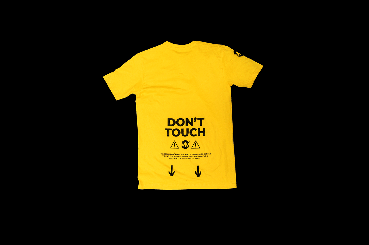
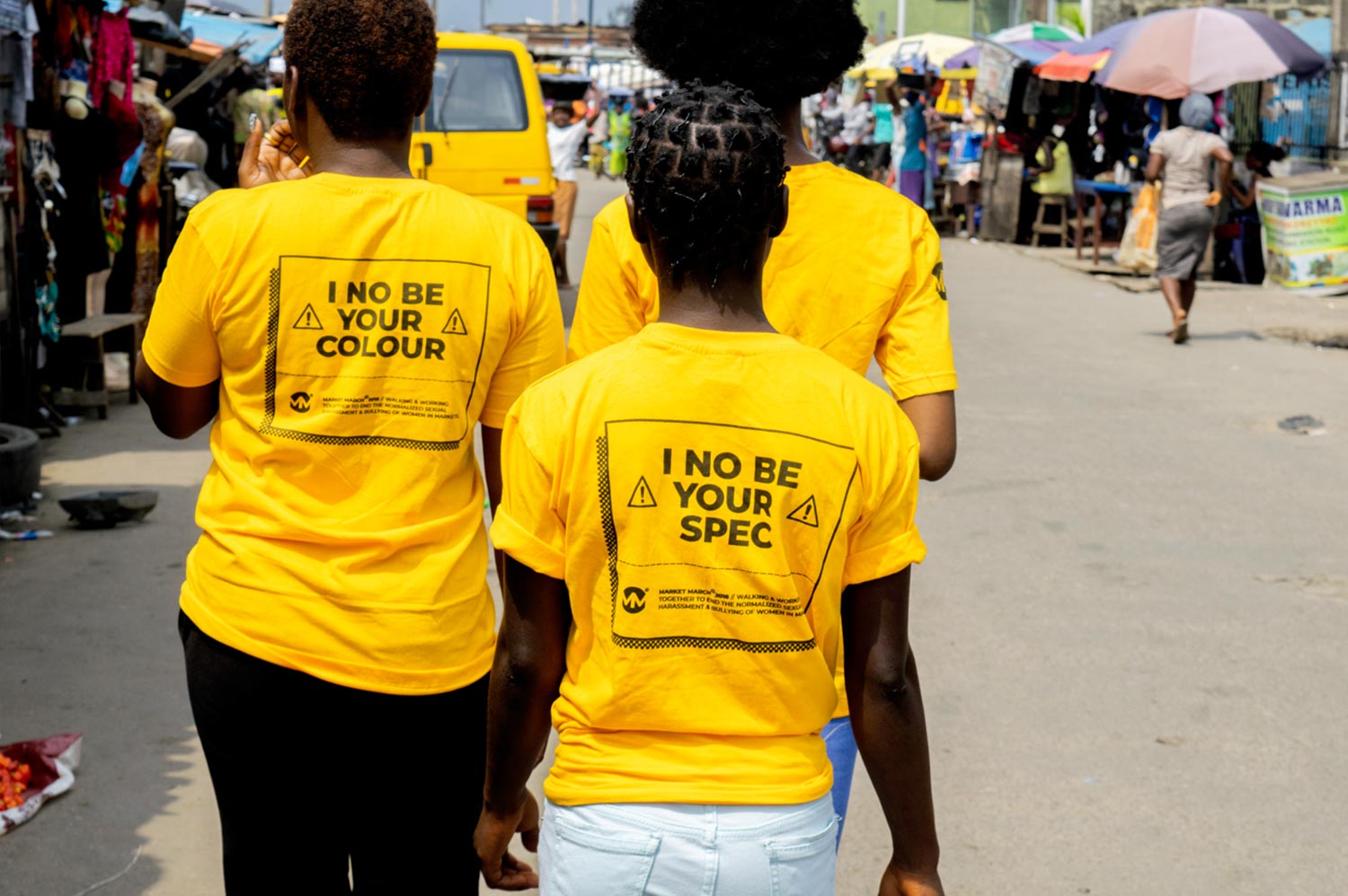
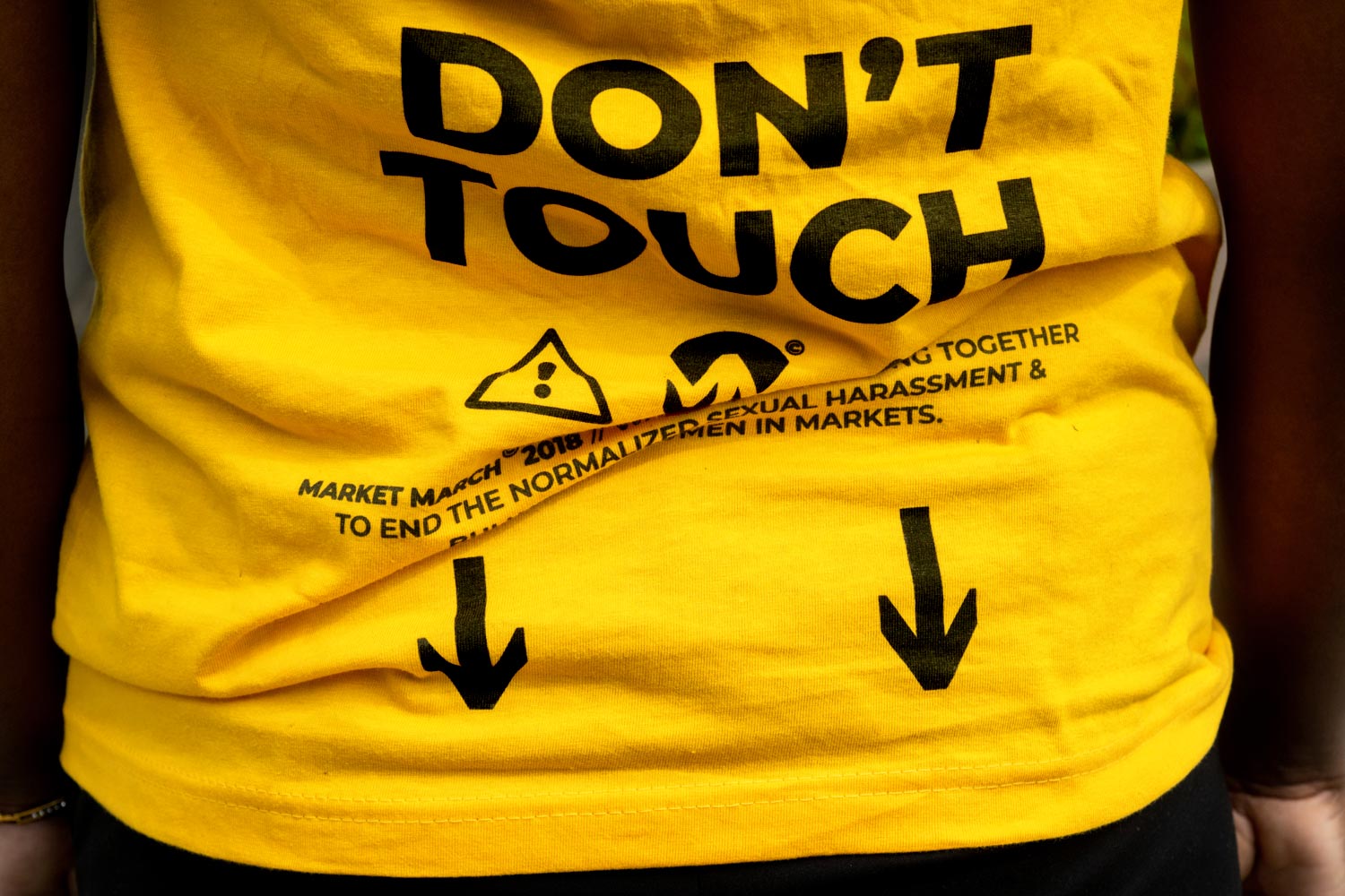
Market March is an initiative walking and working with members of the community to bring an end to the normalized sexual harassment and bullying of women at Markets. This is achieved through targeted campaigns and protests created by everyday women seeking change.
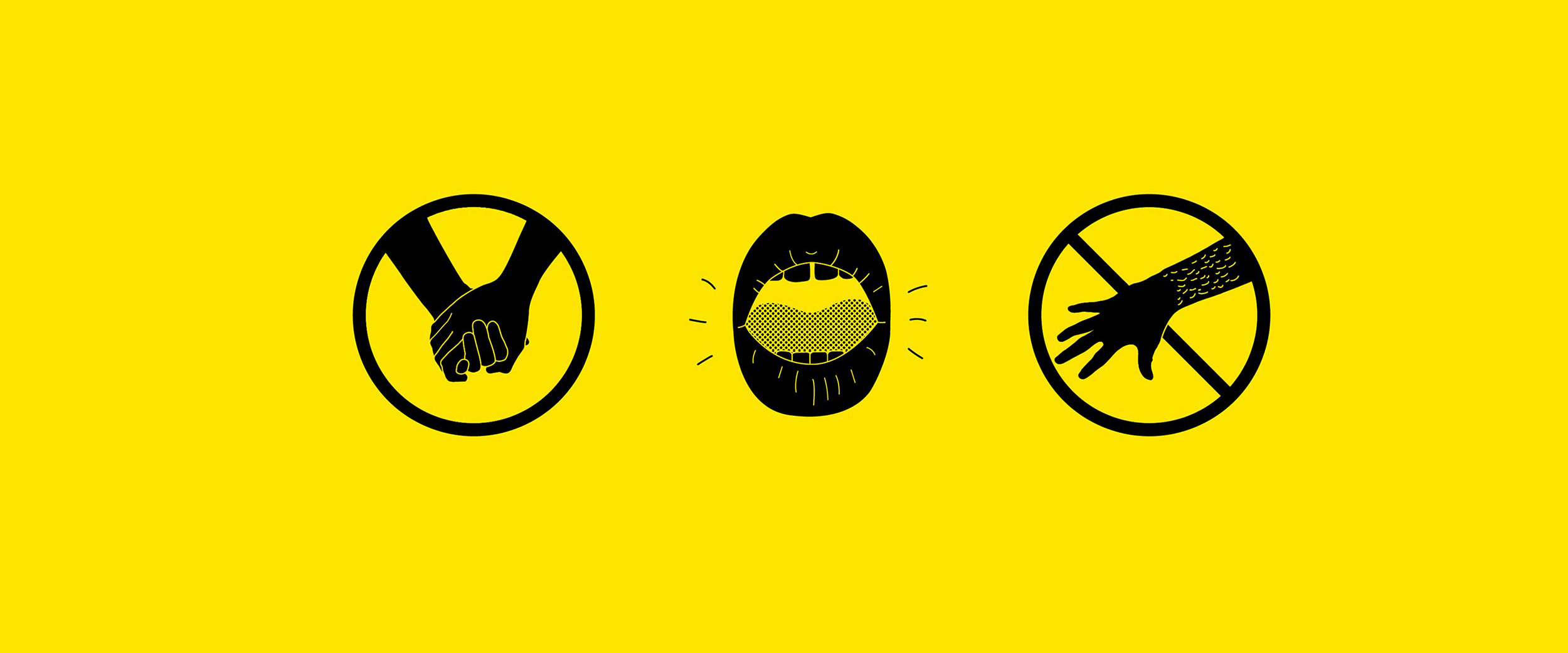
The need was to visually communicate a brand that will feel genuinely accessible. You don’t have to be “somebody” to participate, you just have to be fed up with the ongoing menace. The goal was to inspire the audience in a way that said this was a step towards the change that was within their grasp. The questions became; how do we create something that instigates a sense of genuine solidarity? How do we create a symbol that the everyday market trader — educated or not, can note & effortlessly remember? What will this identity be that equally connects to the women who want to march, yet be a clear understandable warning to the perpetrators? How do we create something universal enough to work across different markets and groups of women and men across Nigeria?
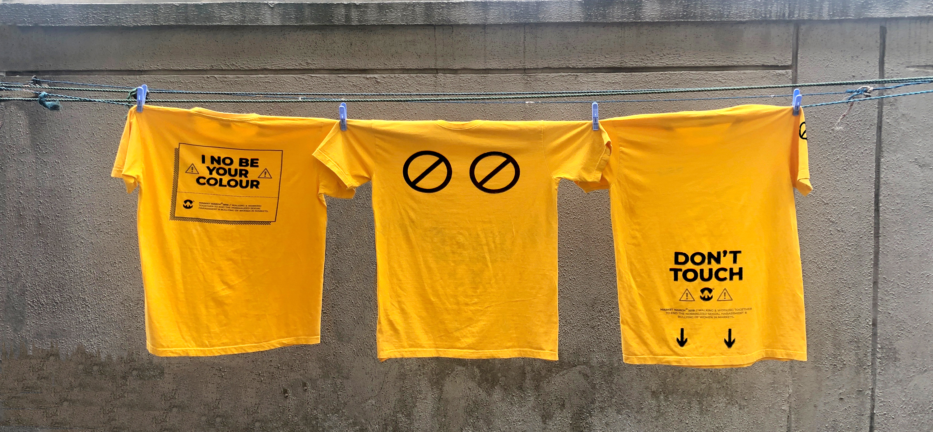
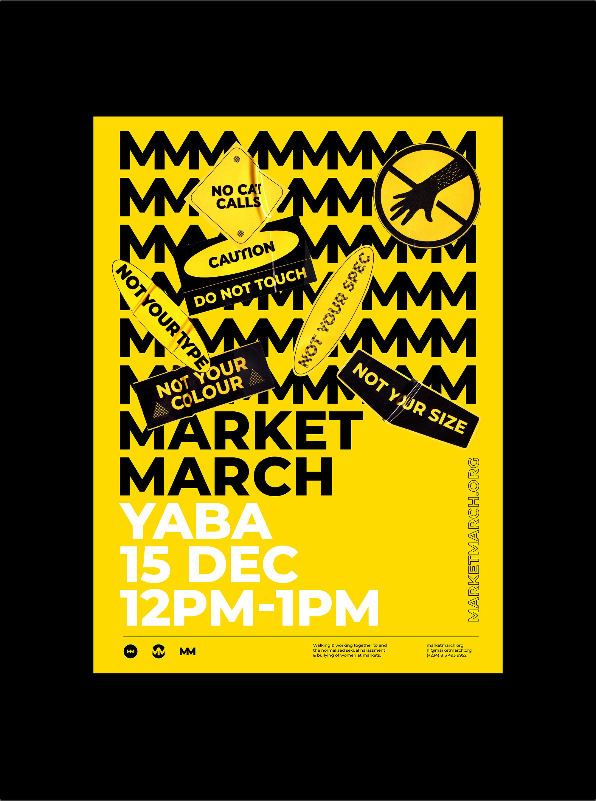
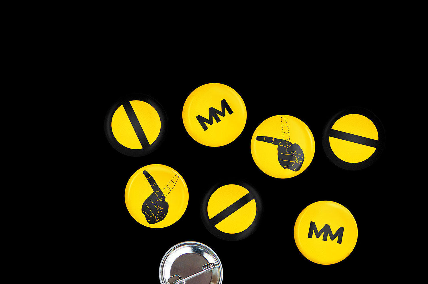
Since we were aiming to genuinely connect and appear real enough to inspire belief in the possibility of change, our guiding visual and conceptual principle became “Take it back to basics.” Visual devices were developed to incite a sense of caution and warning. The identity needed to be heavy on simplicity and clarity. These considerations inspired the choice of colours and overall Graphic Design style.
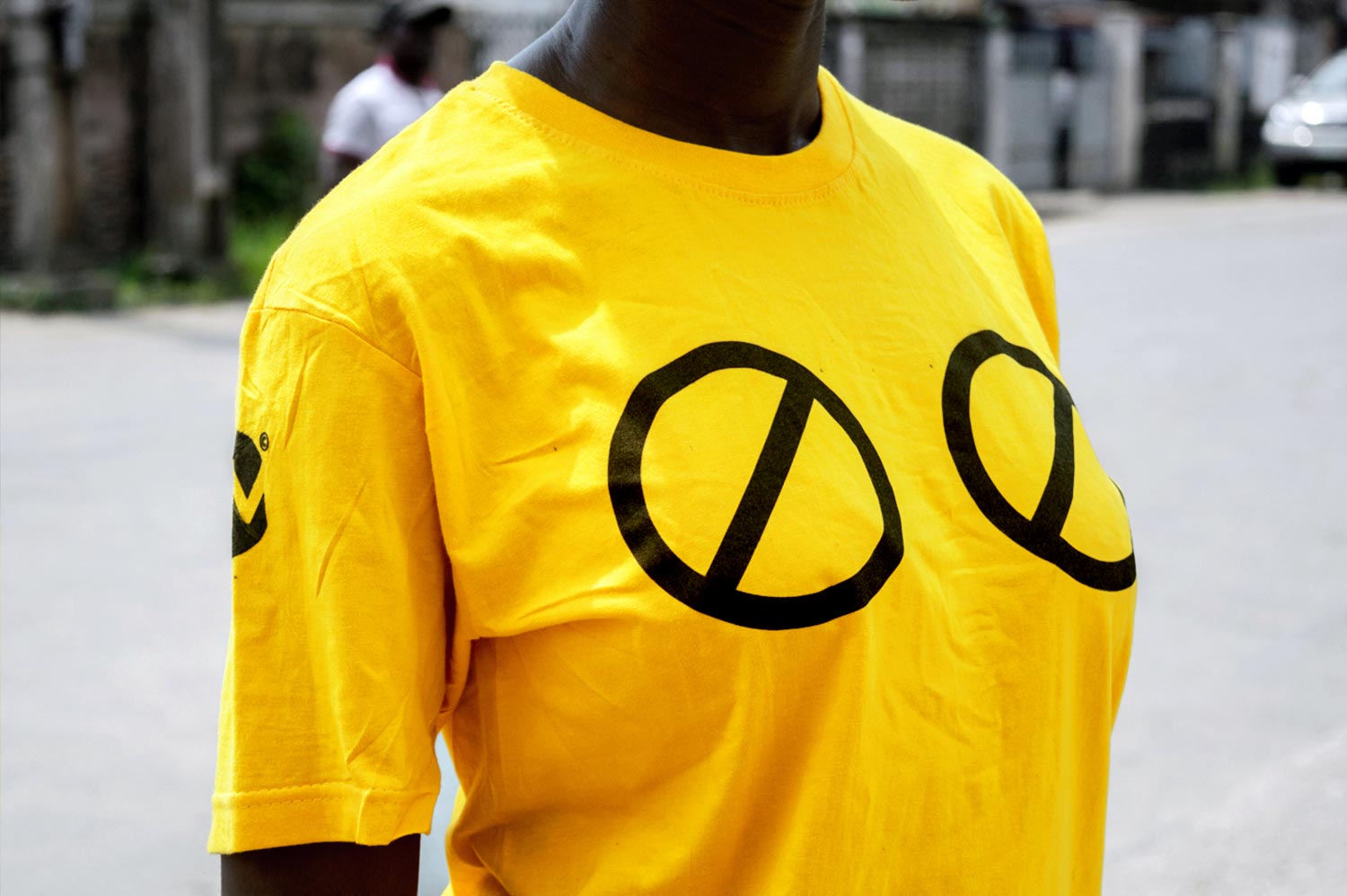
While women have often felt a need to hide while passing through these notorious markets, the striking yellow and black not only says “I’m here, occupying bright and loud,” they also resonate a firm cautioning to perpetrators. The cautionary intents resonated through copy and graphics to tell a complete story that is bold and strong. “Be warned!” is expressed across all the different visual elements of the identity without compromise on solidarity. And it worked! There were tons of organically generated publicity on launch, tons of positive comments about the identity and thanks to the vocal women and men who have protested, perpetrators not mistaking the intentions of the brand.
Market March is an initiative walking and working with members of the community to bring an end to the normalized sexual harassment and bullying of women at Markets. This is achieved through targeted campaigns and protests created by everyday women seeking change.
The need was to visually communicate a brand that will feel genuinely accessible. You don’t have to be “somebody” to participate, you just have to be fed up with the ongoing menace. The goal was to inspire the audience in a way that said this was a step towards the change that was within their grasp. The questions became; how do we create something that instigates a sense of genuine solidarity? How do we create a symbol that the everyday market trader — educated or not, can note & effortlessly remember? What will this identity be that equally connects to the women who want to march, yet be a clear understandable warning to the perpetrators? How do we create something universal enough to work across different markets and groups of women and men across Nigeria?
Since we were aiming to genuinely connect and appear real enough to inspire belief in the possibility of change, our guiding visual and conceptual principle became “Take it back to basics.” Visual devices were developed to incite a sense of caution and warning. The identity needed to be heavy on simplicity and clarity. These considerations inspired the choice of colours and overall Graphic Design style.
While women have often felt a need to hide while passing through these notorious markets, the striking yellow and black not only says “I’m here, occupying bright and loud,” they also resonate a firm cautioning to perpetrators. The cautionary intents resonated through copy and graphics to tell a complete story that is bold and strong. “Be warned!” is expressed across all the different visual elements of the identity without compromise on solidarity. And it worked! There were tons of organically generated publicity on launch, tons of positive comments about the identity and thanks to the vocal women and men who have protested, perpetrators not mistaking the intentions of the brand.