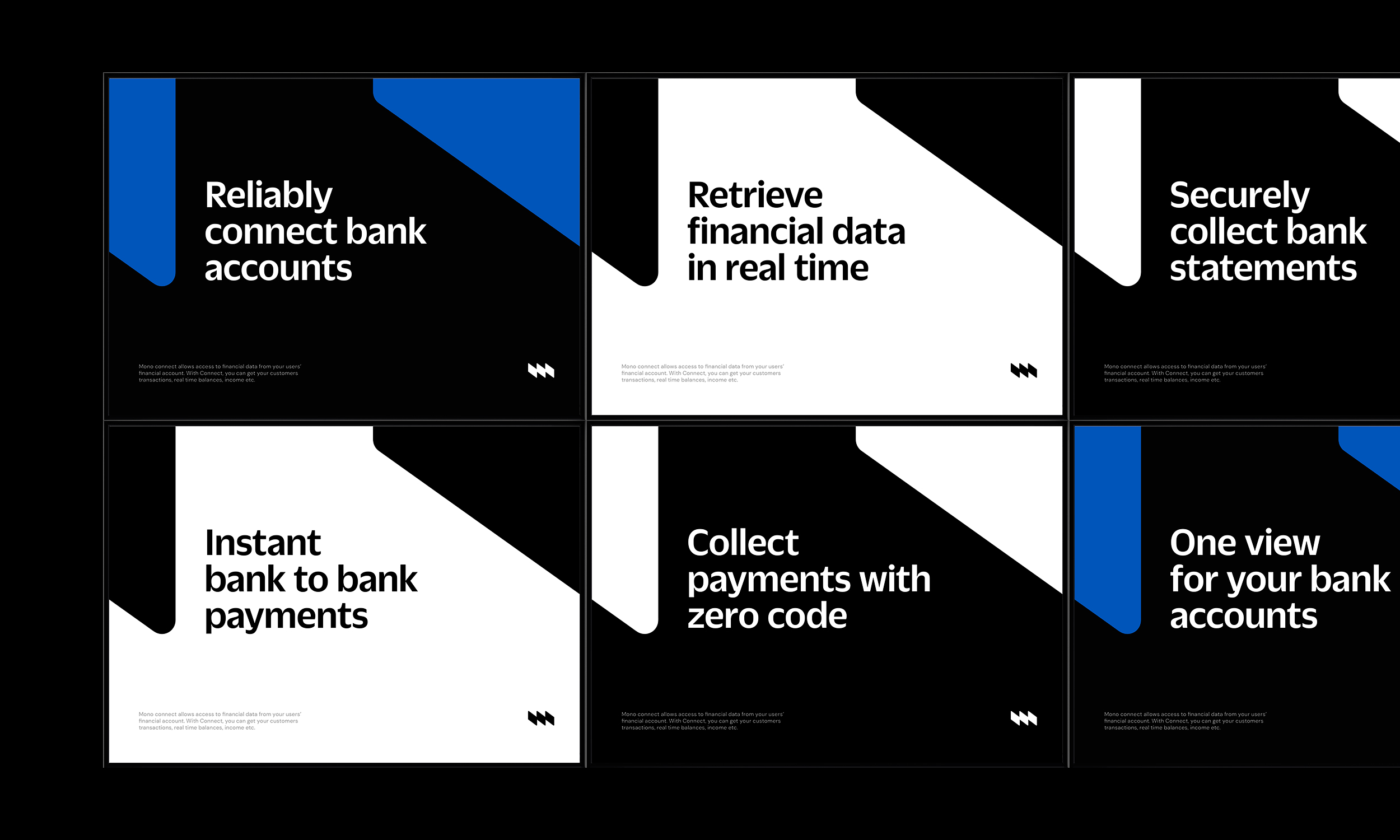
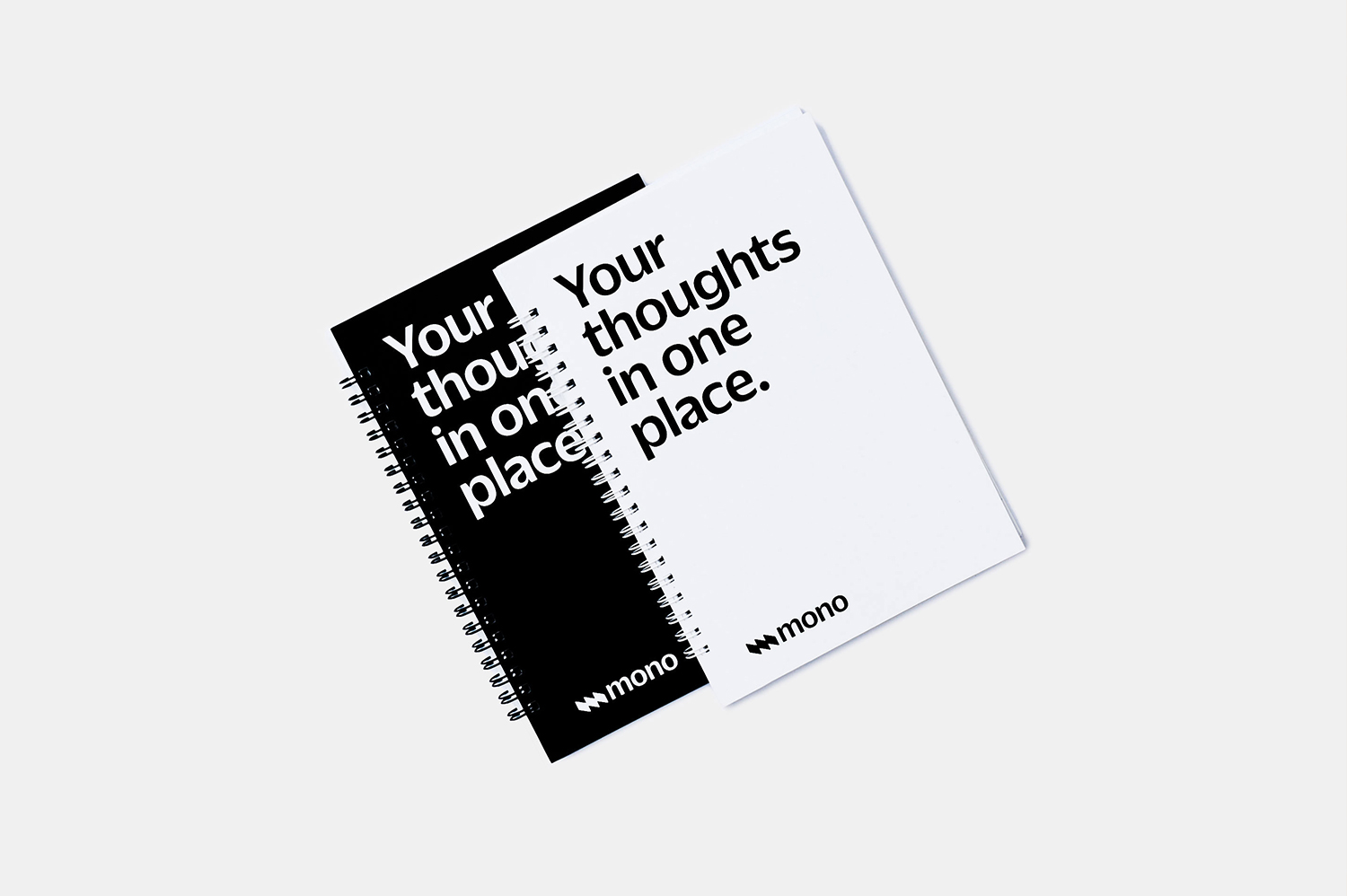
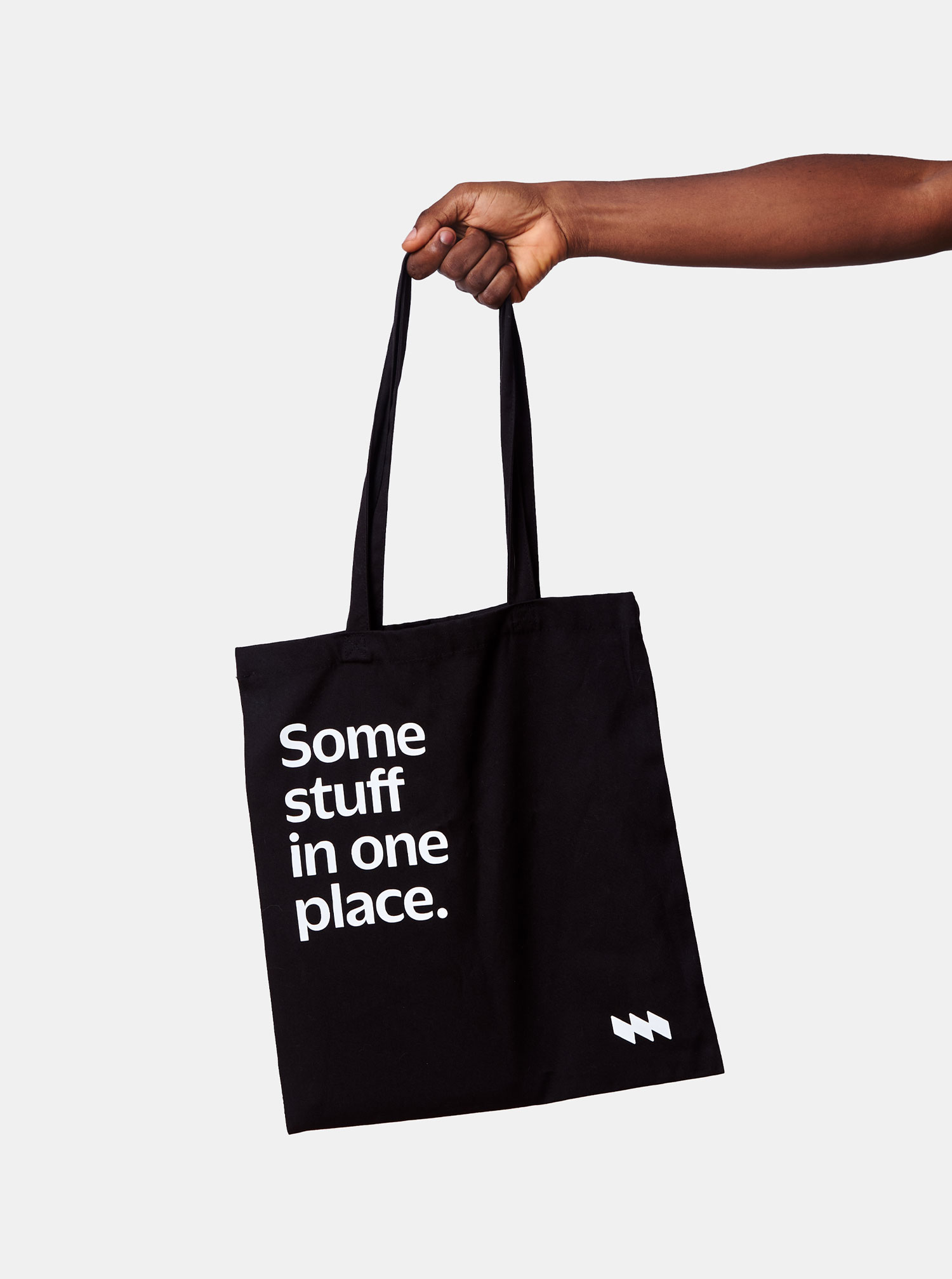
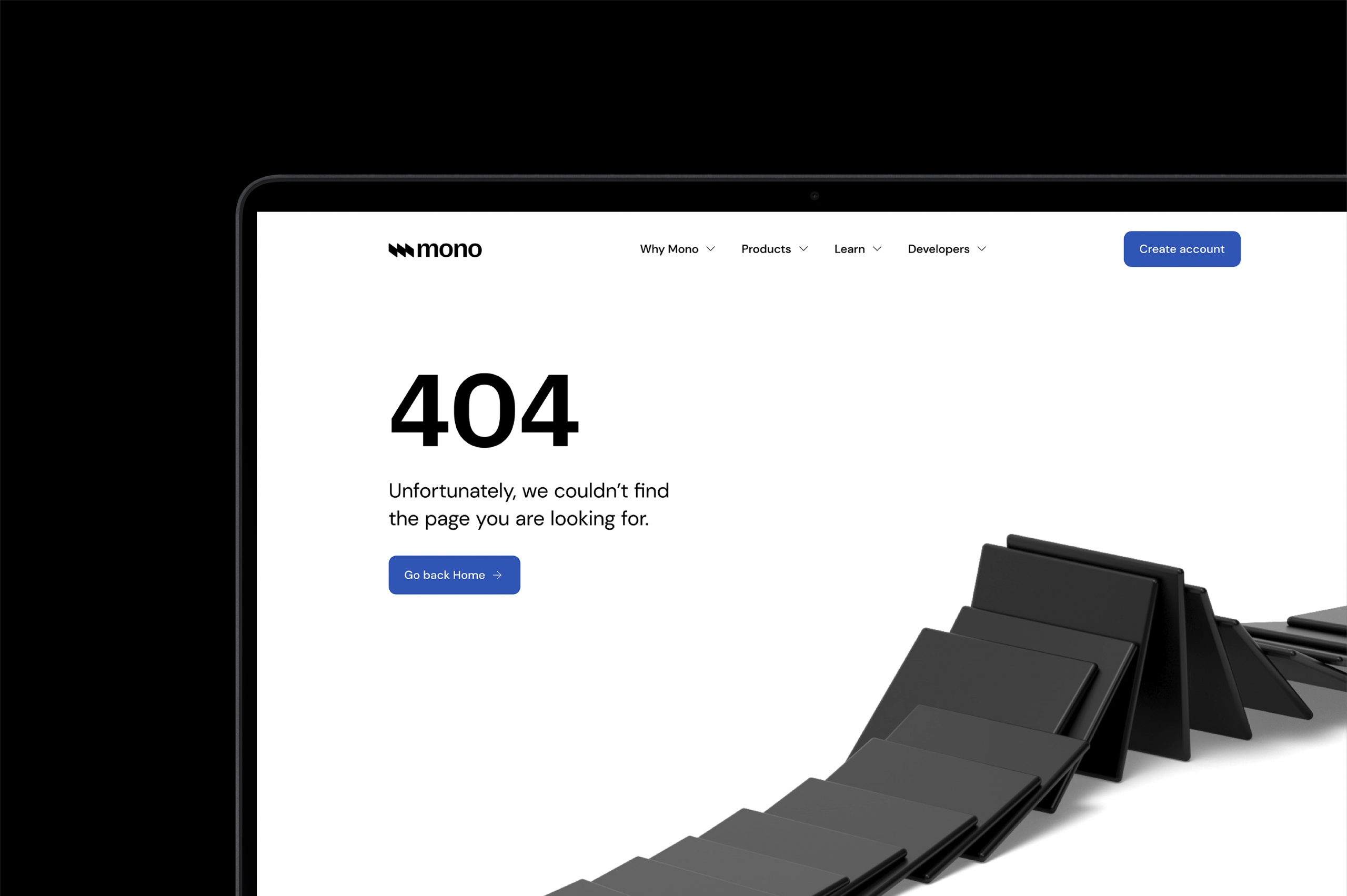
Mono helps digital businesses in Africa securely access their customers’ bank accounts for data and payments when the customers permit it. They also look to create an avenue for customers to aggregate all their data in one place. This creates exciting possibilities for African businesses to create better and more seamless experiences and products for their customers.
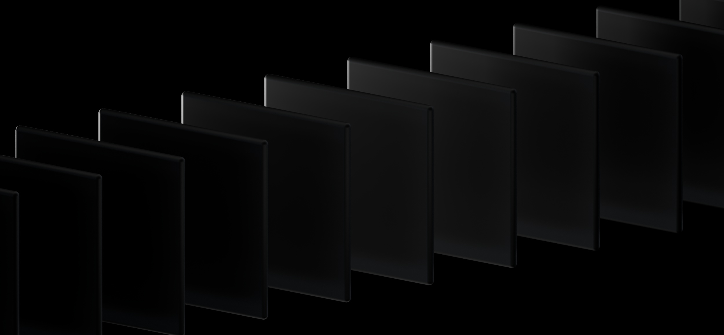
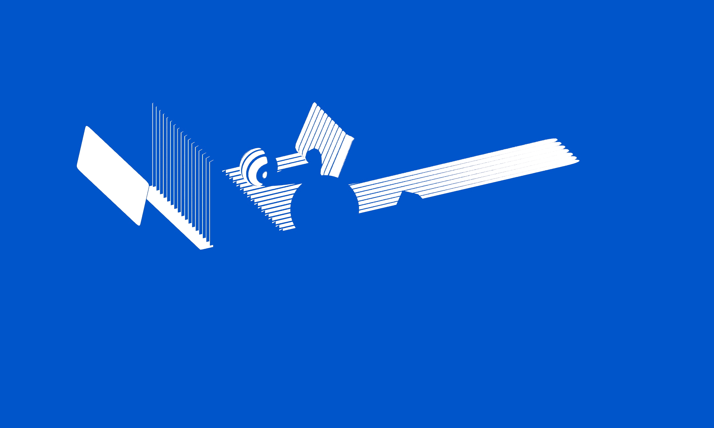
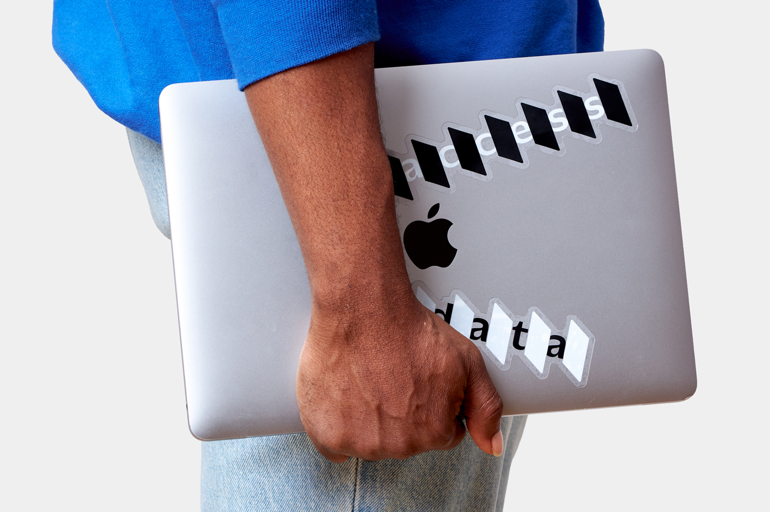
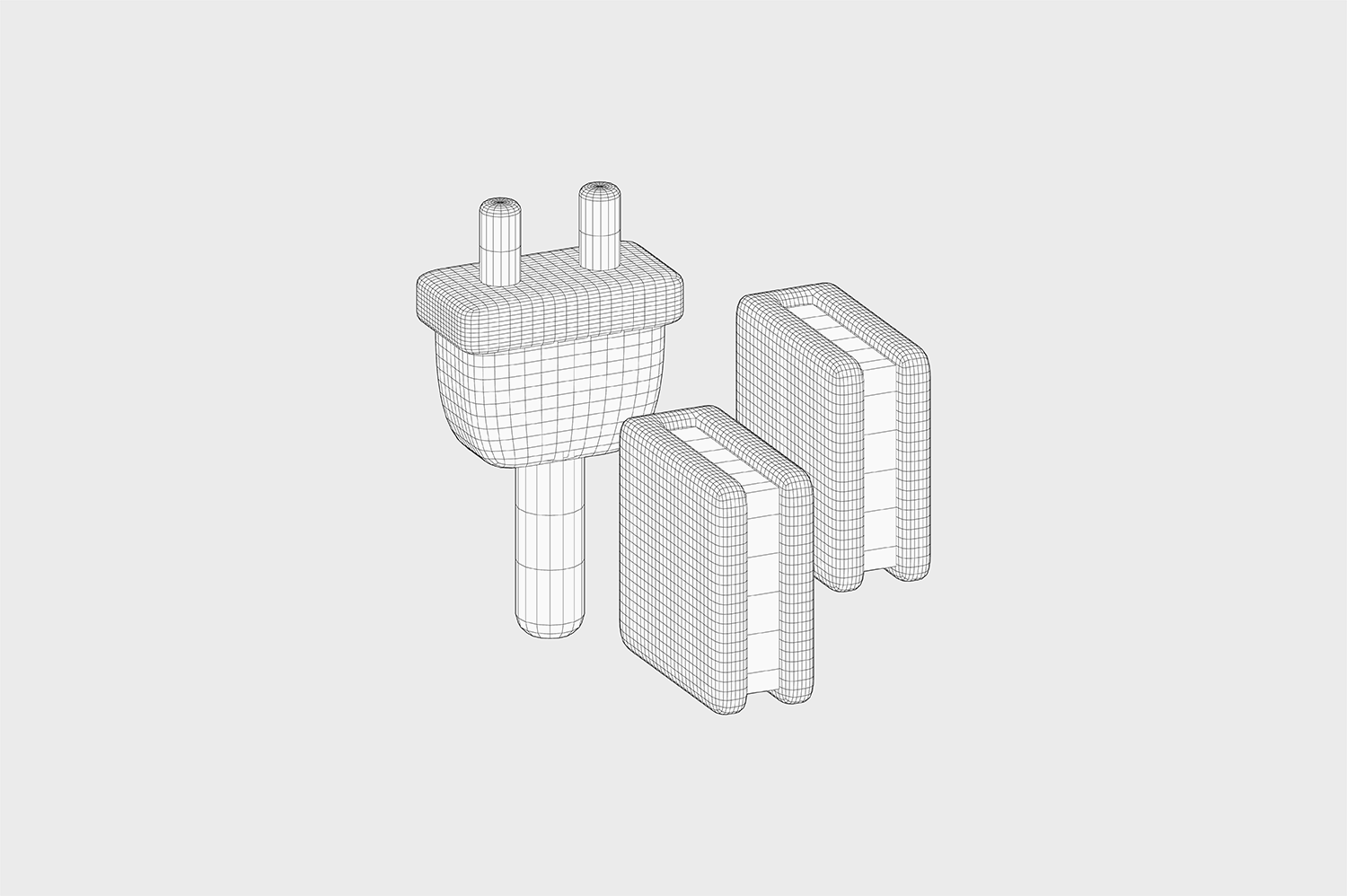
Access and trust are the two most important factors for Mono. Access is the main product offering. More access translates to more opportunities, but also more concerns about safety, and privacy. Mono has that well-covered for with their very secure APIs. Mono acts as a secure doorway, a secure connector between customers and businesses that need their financial data. Translating how they've successfully resolved that balance of security and access into an identity was our most fundamental design question - Can trust and access visually coexist? How can we create an identity that embodies the access that Mono provides, while reinforcing that it’s not just "access", but secure access worthy of trust?
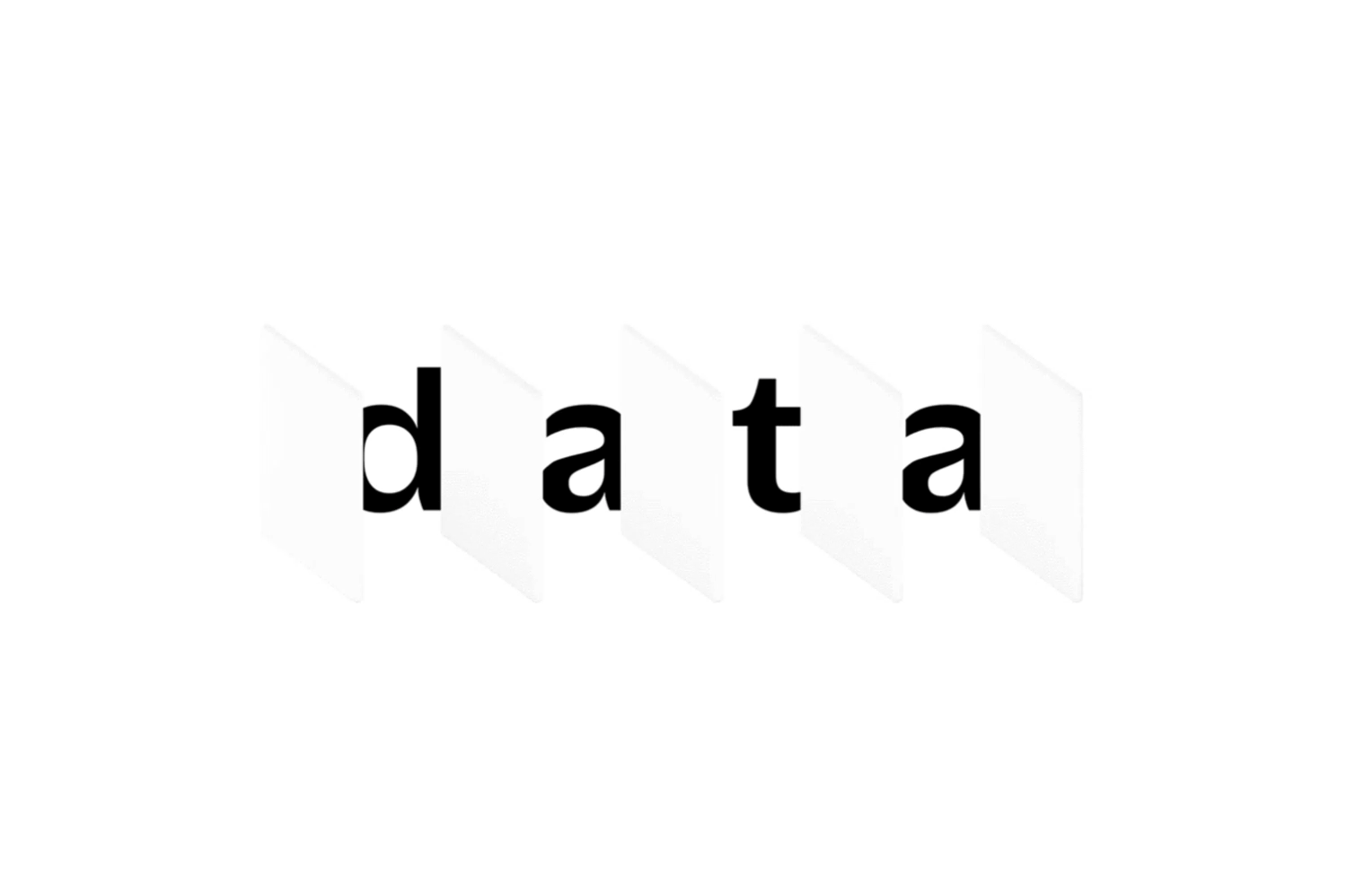
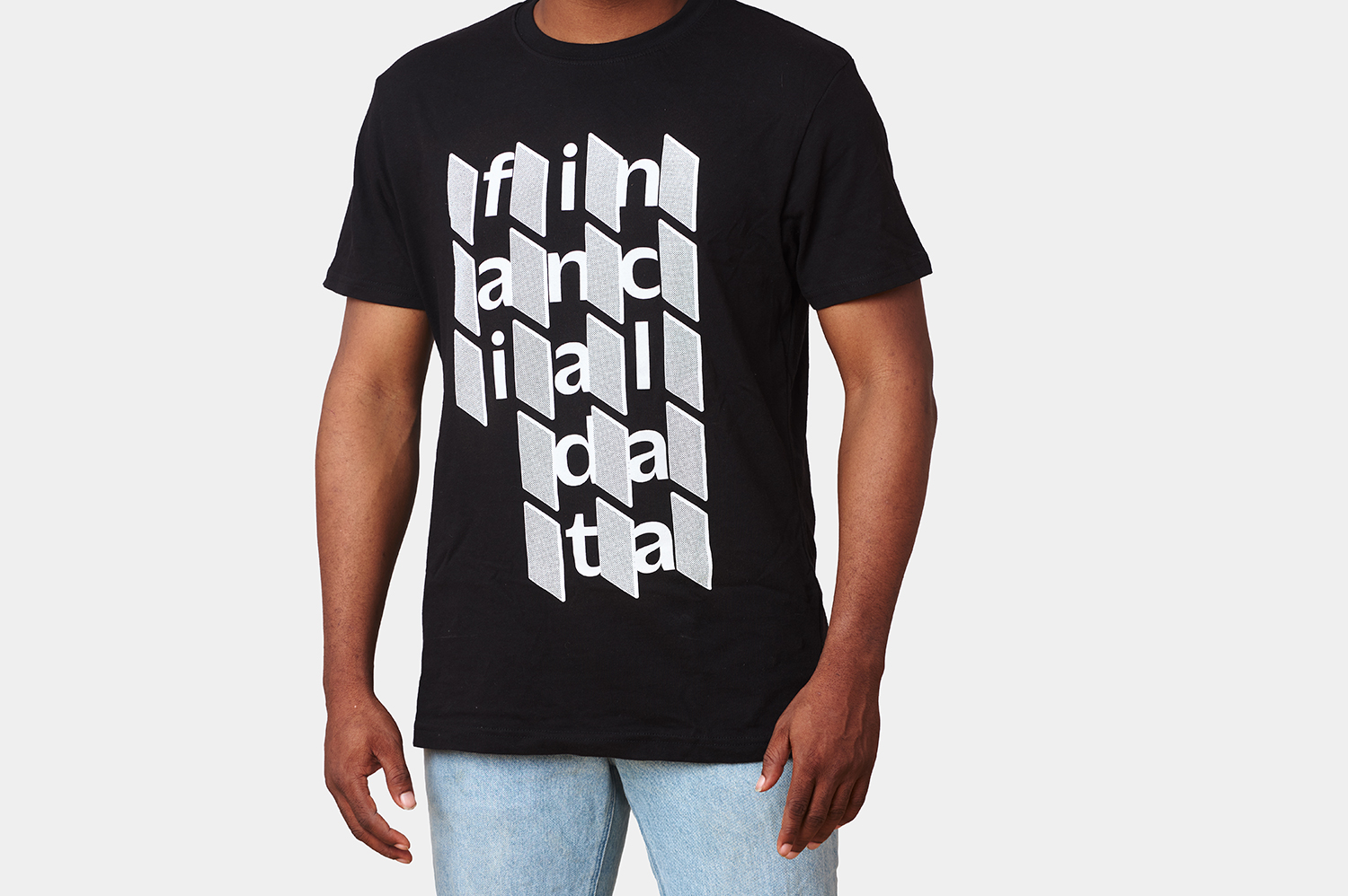
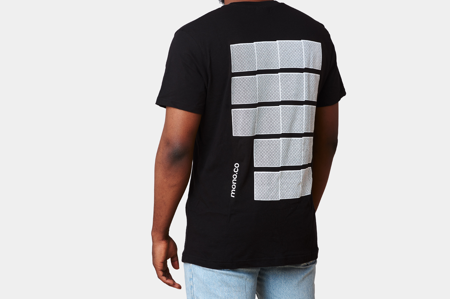
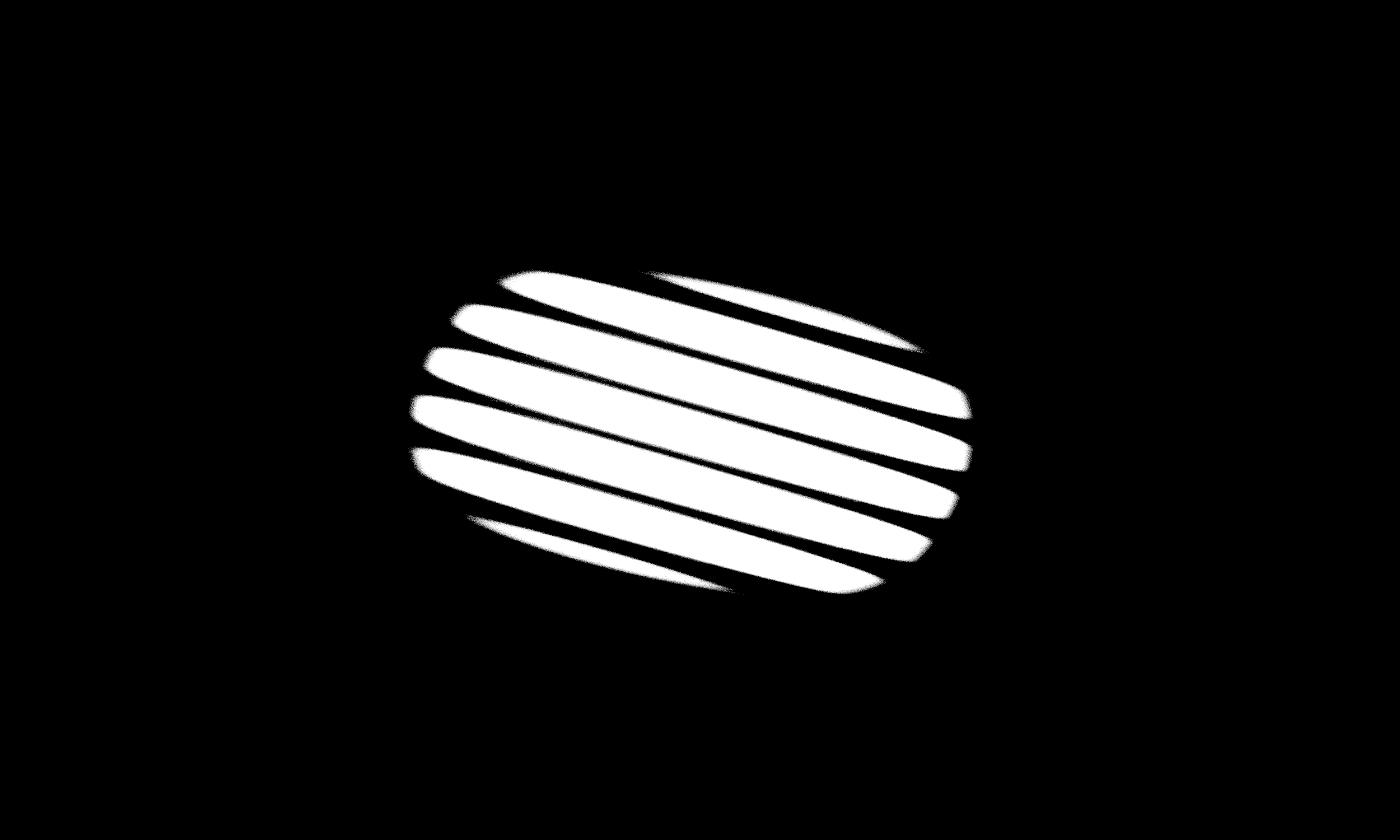
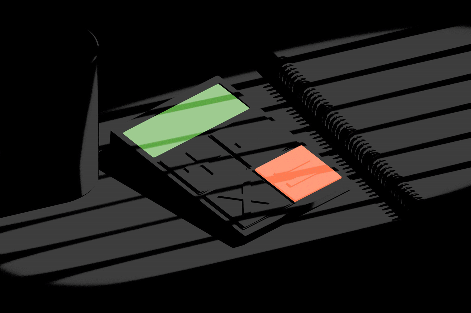
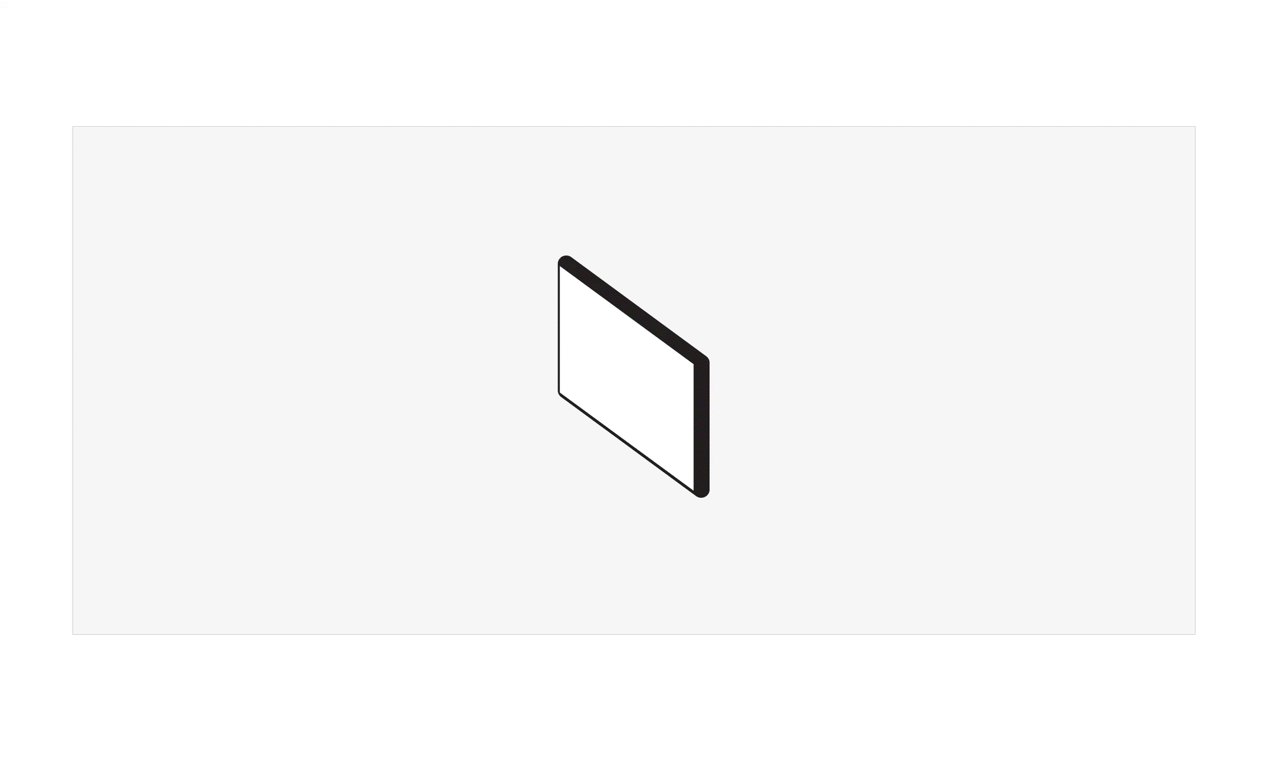
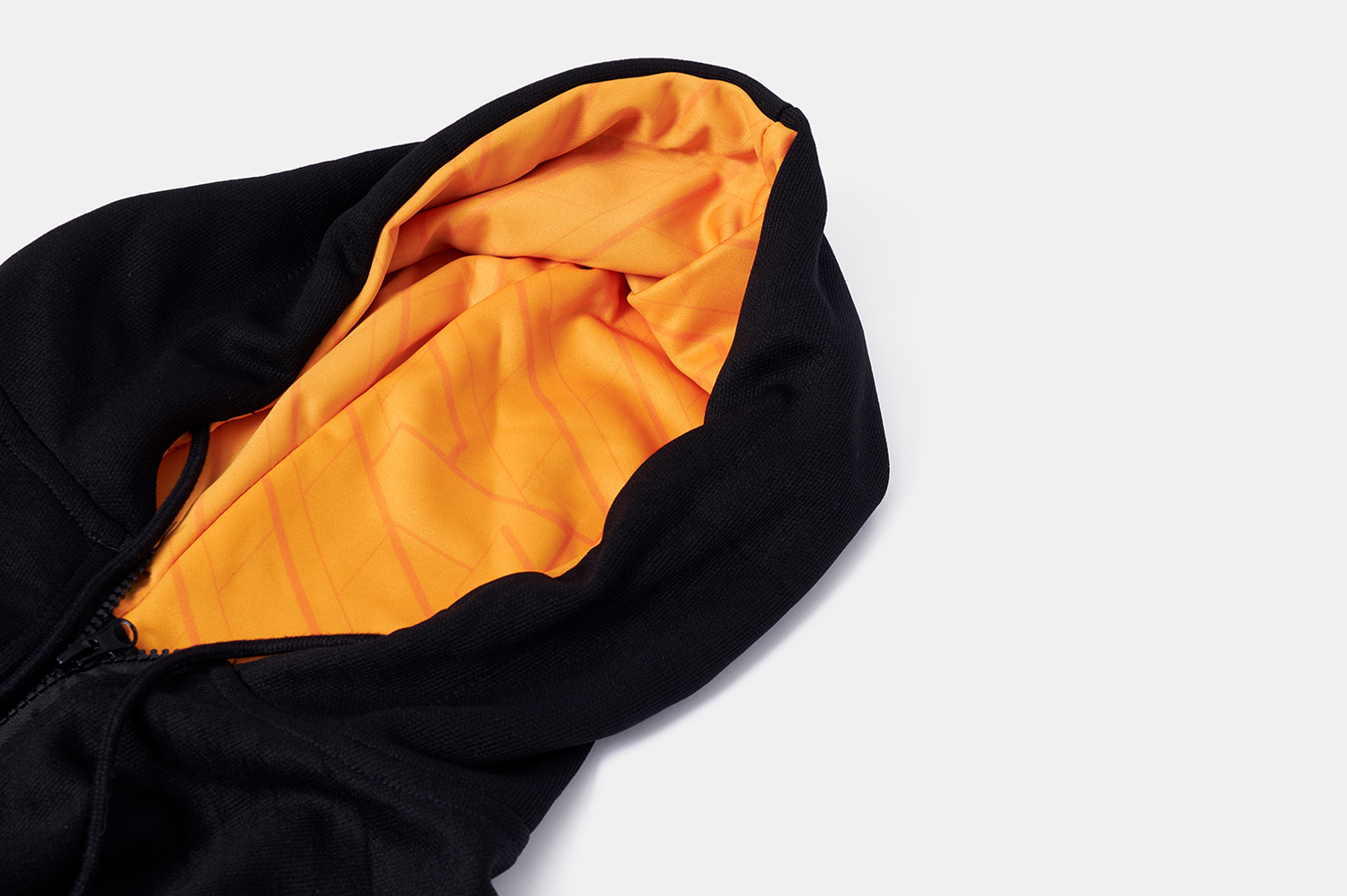
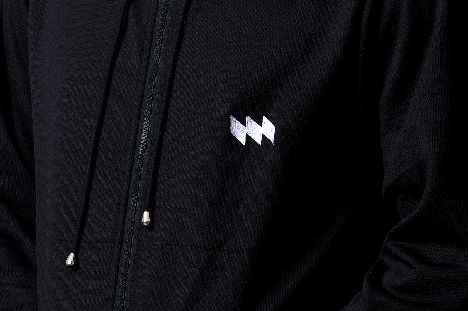
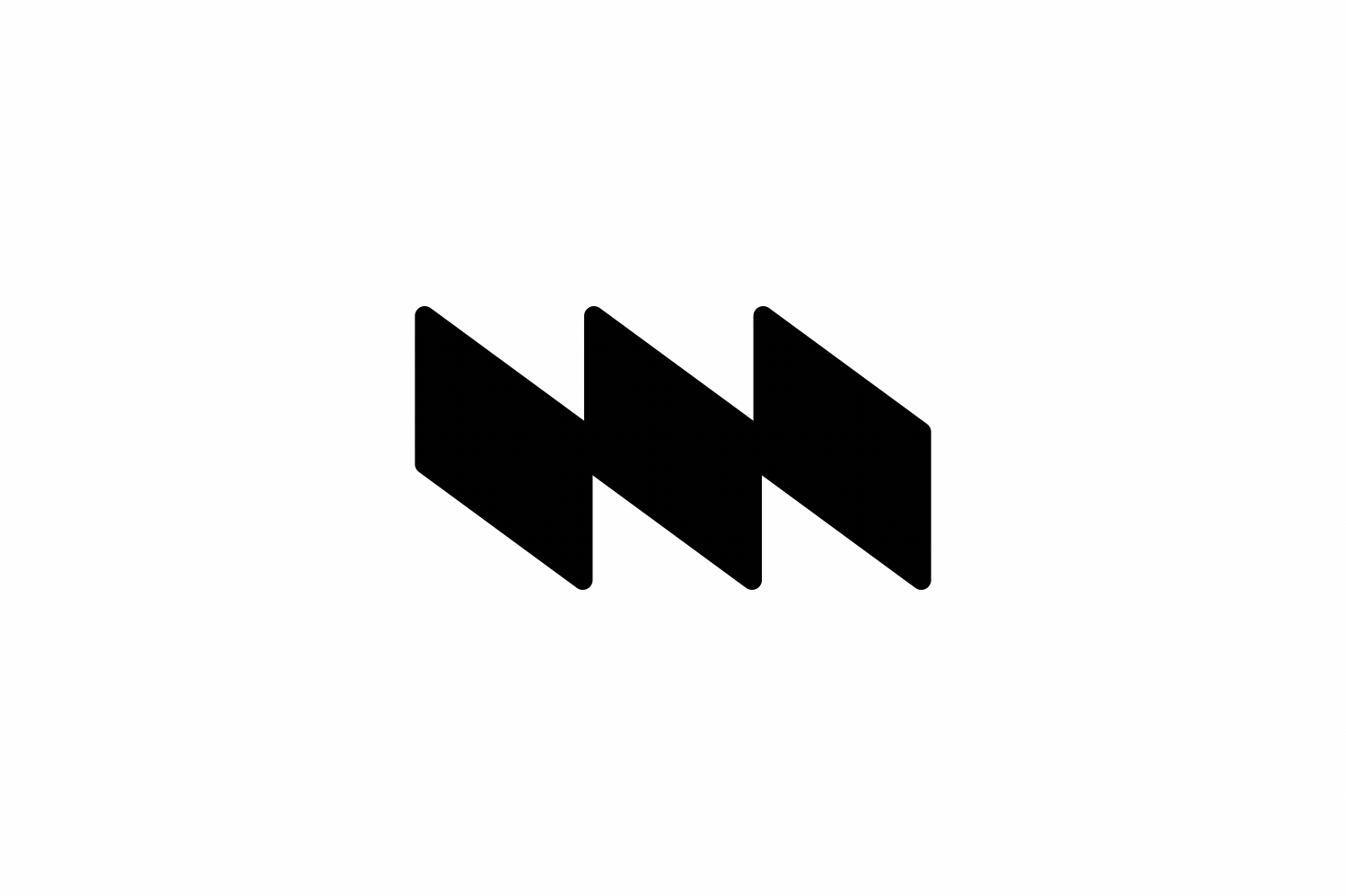
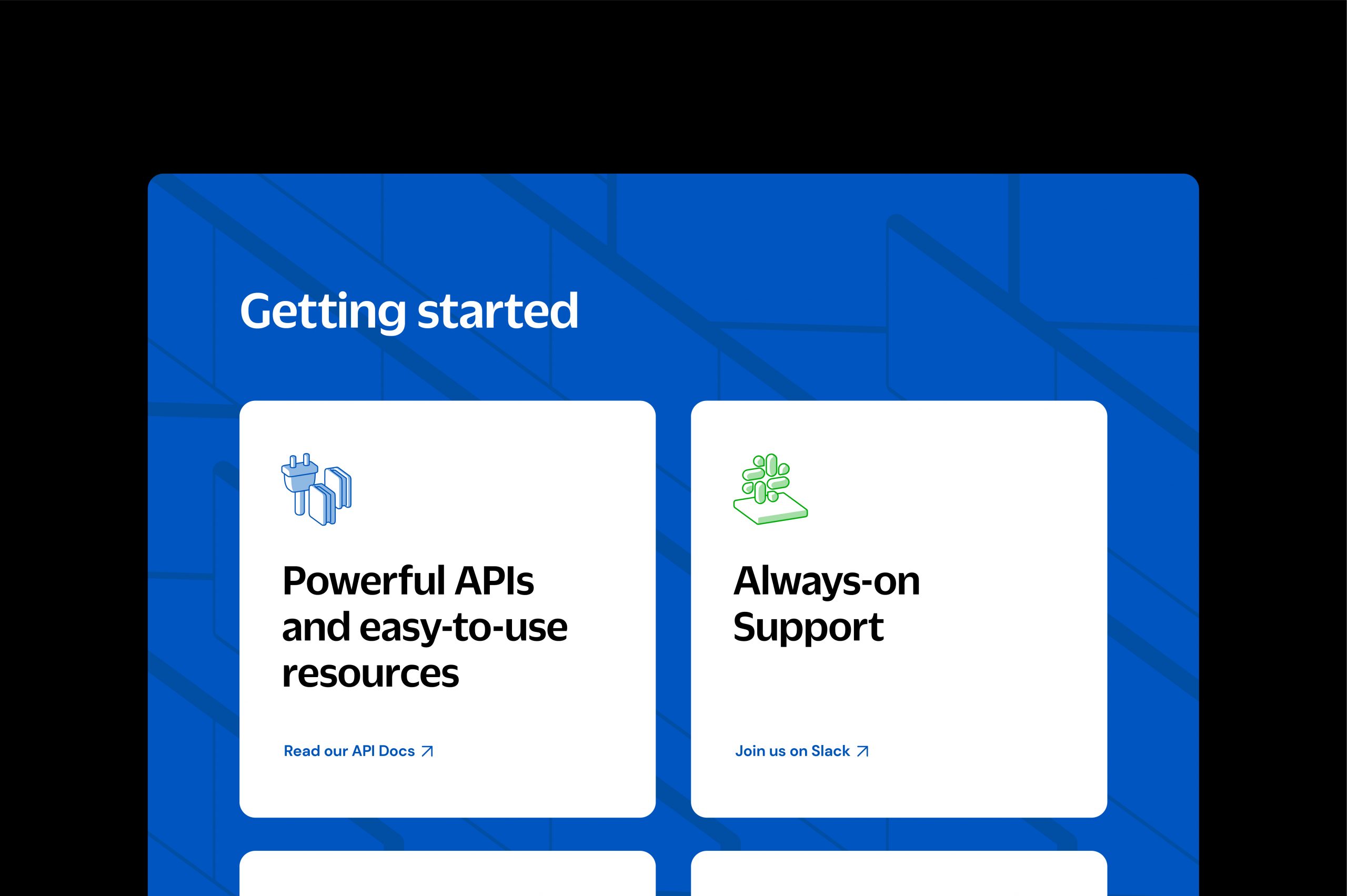
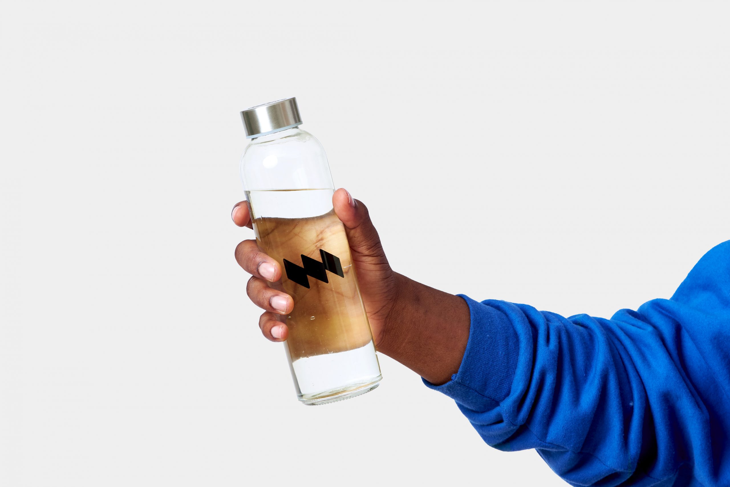
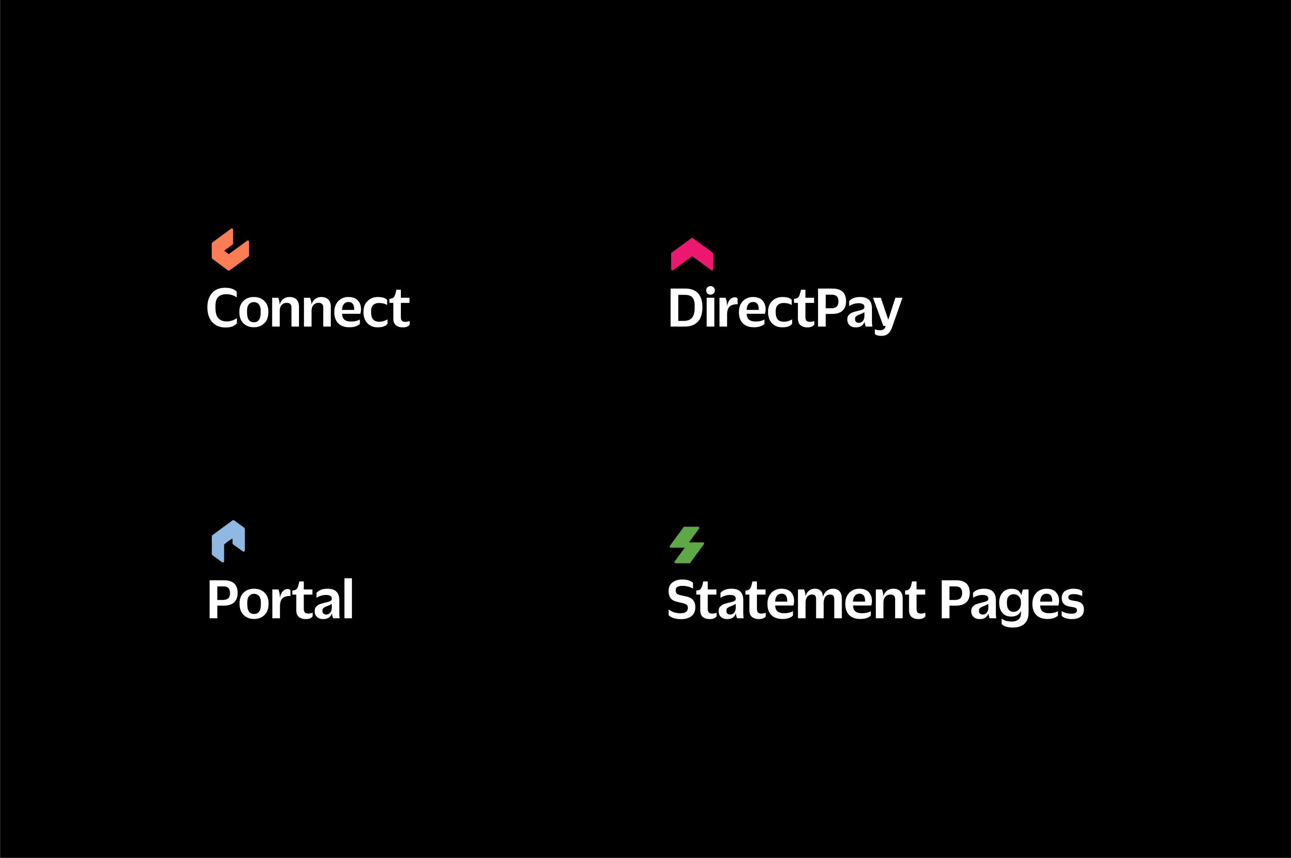
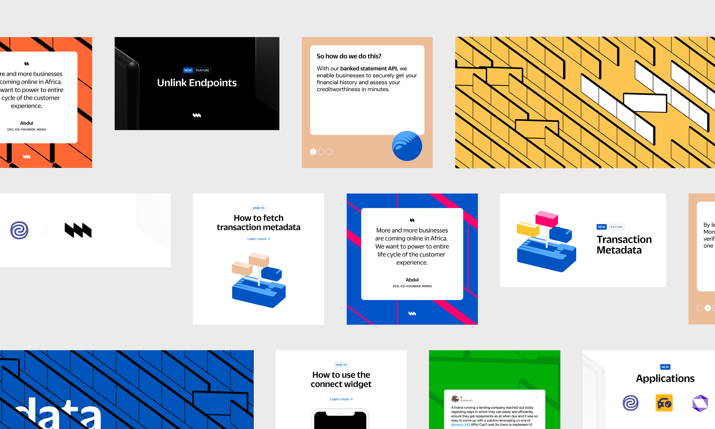
Trust and access are inherent in the behaviour of the louvres. That they can open up represents access, and that they can be closed or controlled communicates the security of that access, as well as the autonomy of the customers to share only what they allow. This is the foundation of every design choice, from the Logomark which is three louvres and an M for Mono, to colours, illustrative style, patterns, etc. Because this was a rebrand, we maintained some elements of familiarity from the previous identity. The main brand colour blue was retained but also given a new meaning. The palette was expanded to include black and white to reinforce trust, and a handful of vibrant colours which express access. In the end, we not only communicated trust and access, but we also grounded both in the name Mono - by effectively embodying both concepts in one single device that created many others.
Mono helps digital businesses in Africa securely access their customers’ bank accounts for data and payments when the customers permit it. They also look to create an avenue for customers to aggregate all their data in one place. This creates exciting possibilities for African businesses to create better and more seamless experiences and products for their customers.
Access and trust are the two most important factors for Mono. Access is the main product offering. More access translates to more opportunities, but also more concerns about safety, and privacy. Mono has that well-covered for with their very secure APIs. Mono acts as a secure doorway, a secure connector between customers and businesses that need their financial data. Translating how they've successfully resolved that balance of security and access into an identity was our most fundamental design question - Can trust and access visually coexist? How can we create an identity that embodies the access that Mono provides, while reinforcing that it’s not just "access", but secure access worthy of trust?
Trust and access are inherent in the behaviour of the louvres. That they can open up represents access, and that they can be closed or controlled communicates the security of that access, as well as the autonomy of the customers to share only what they allow. This is the foundation of every design choice, from the Logomark which is three louvres and an M for Mono, to colours, illustrative style, patterns, etc. Because this was a rebrand, we maintained some elements of familiarity from the previous identity. The main brand colour blue was retained but also given a new meaning. The palette was expanded to include black and white to reinforce trust, and a handful of vibrant colours which express access. In the end, we not only communicated trust and access, but we also grounded both in the name Mono - by effectively embodying both concepts in one single device that created many others.