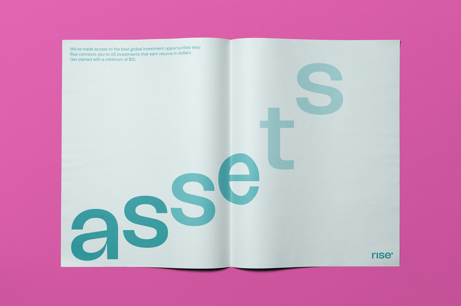
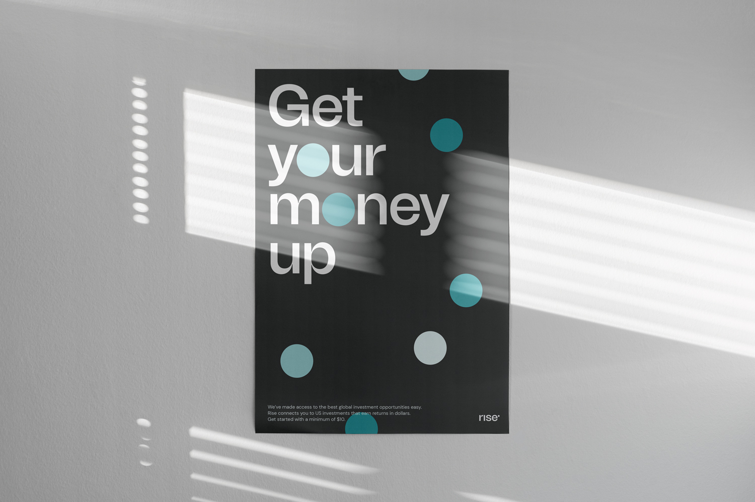
Rise wants everyone, regardless of social or financial status, to have access to dollar investments that will enable them to grow financially. Rise professionally manages its users' investments by providing investment options for different risk appetites. With users being able to start investing with as little as $10, Rise is on its way to becoming a hedge fund for any and everyone in Africa.
Considering that inclusion, steady financial growth and a thriving community are essential to Rise. The main design questions were: how do we visually translate all the existing values into an identity that embodies these values? How do we create an identity which communicates that everyone really is welcome?
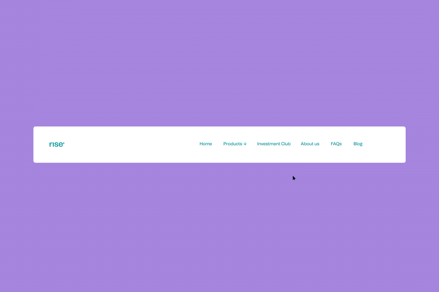
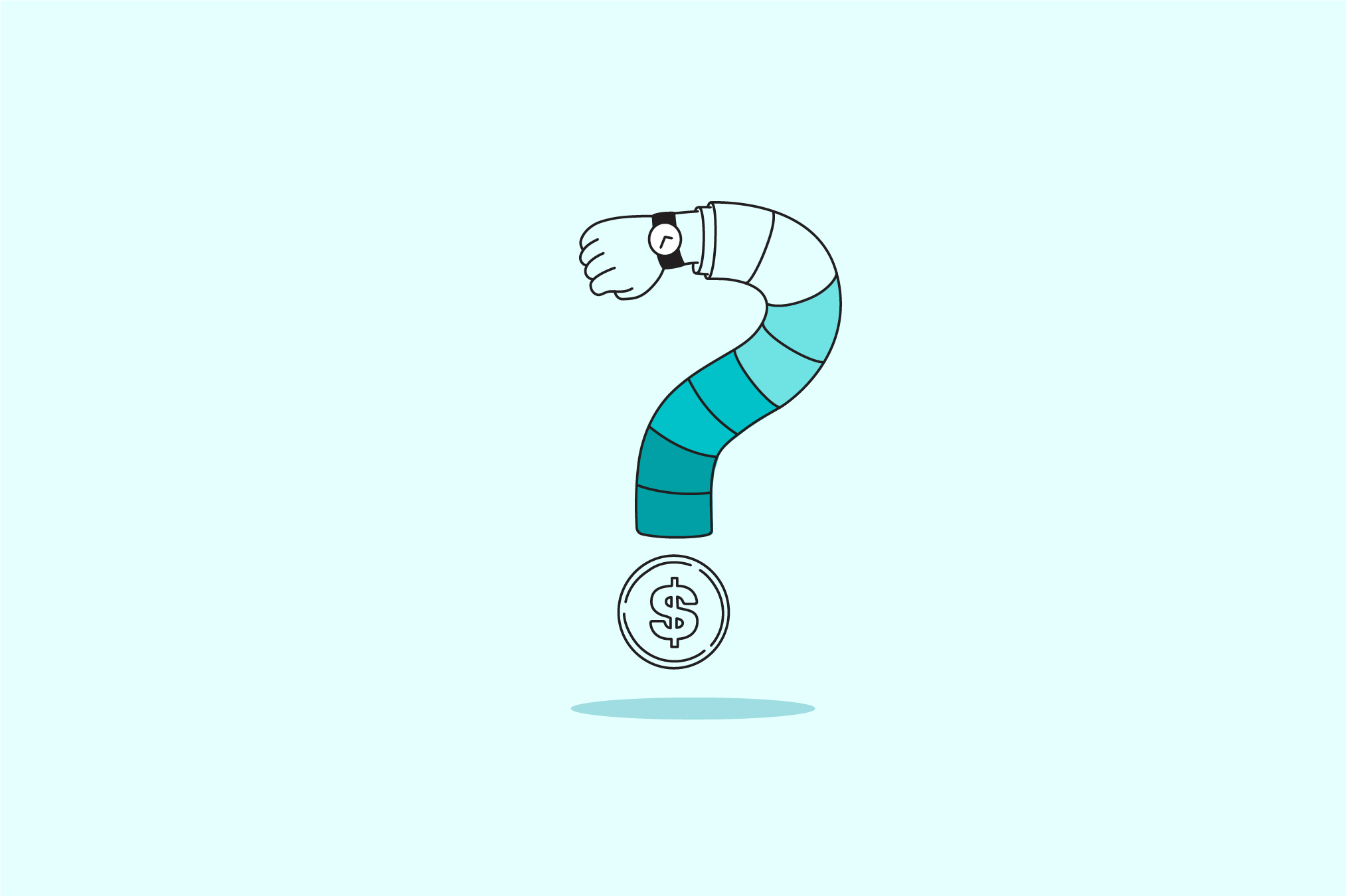
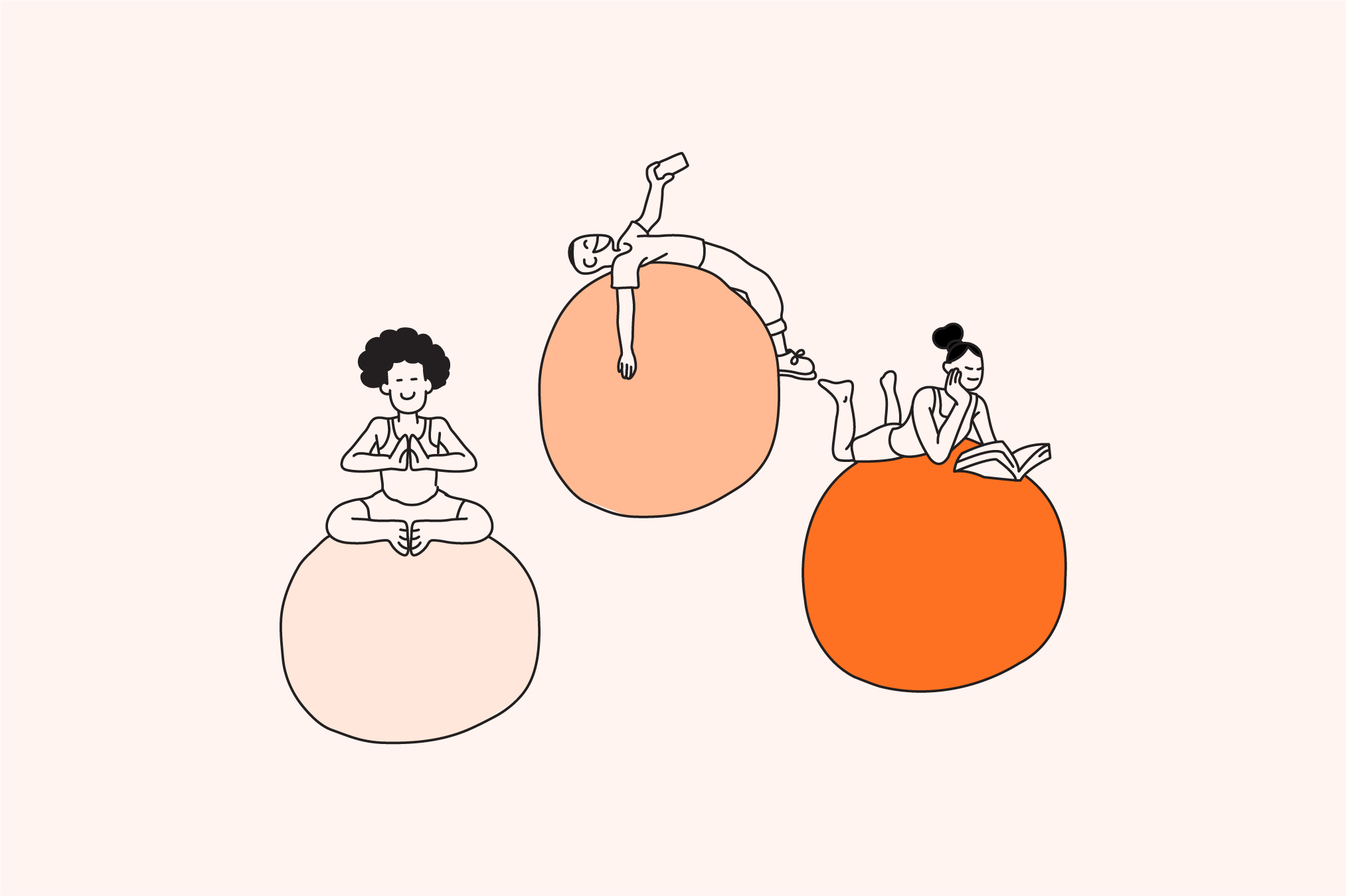
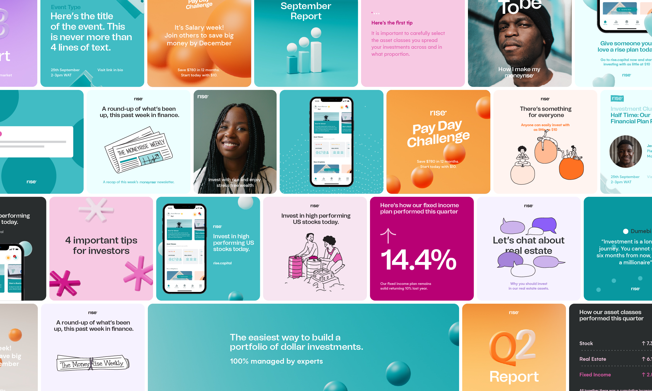
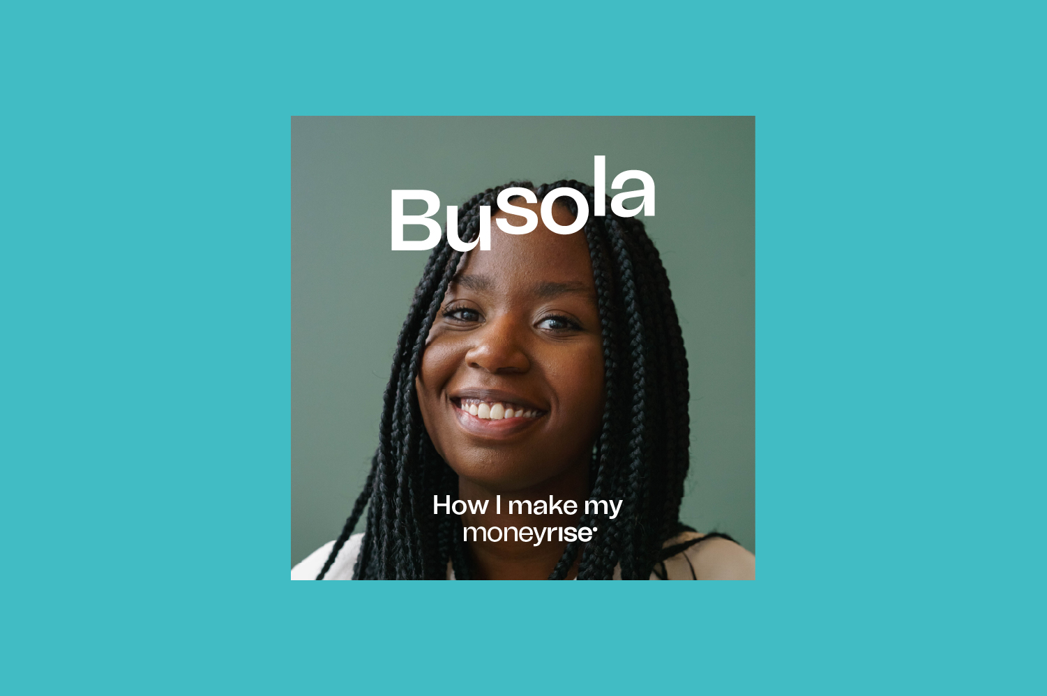
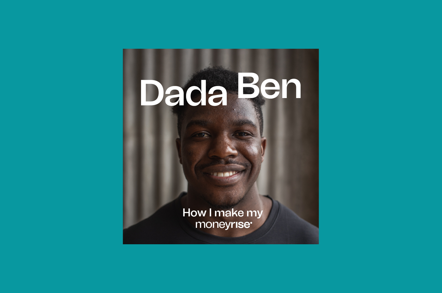
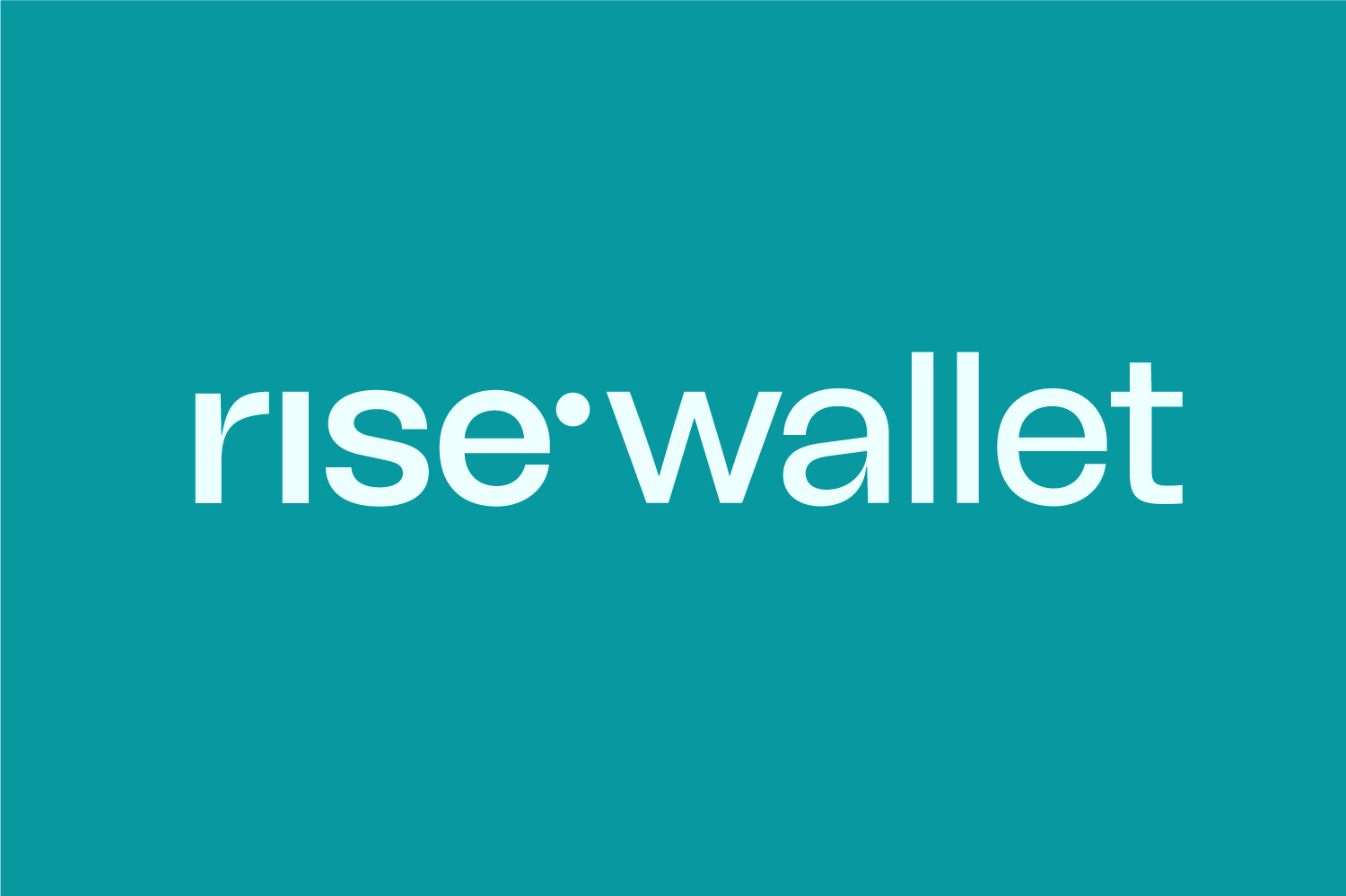
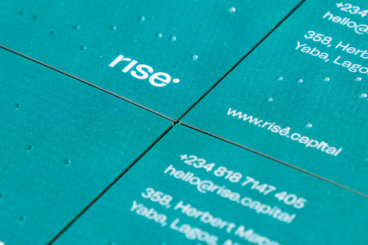
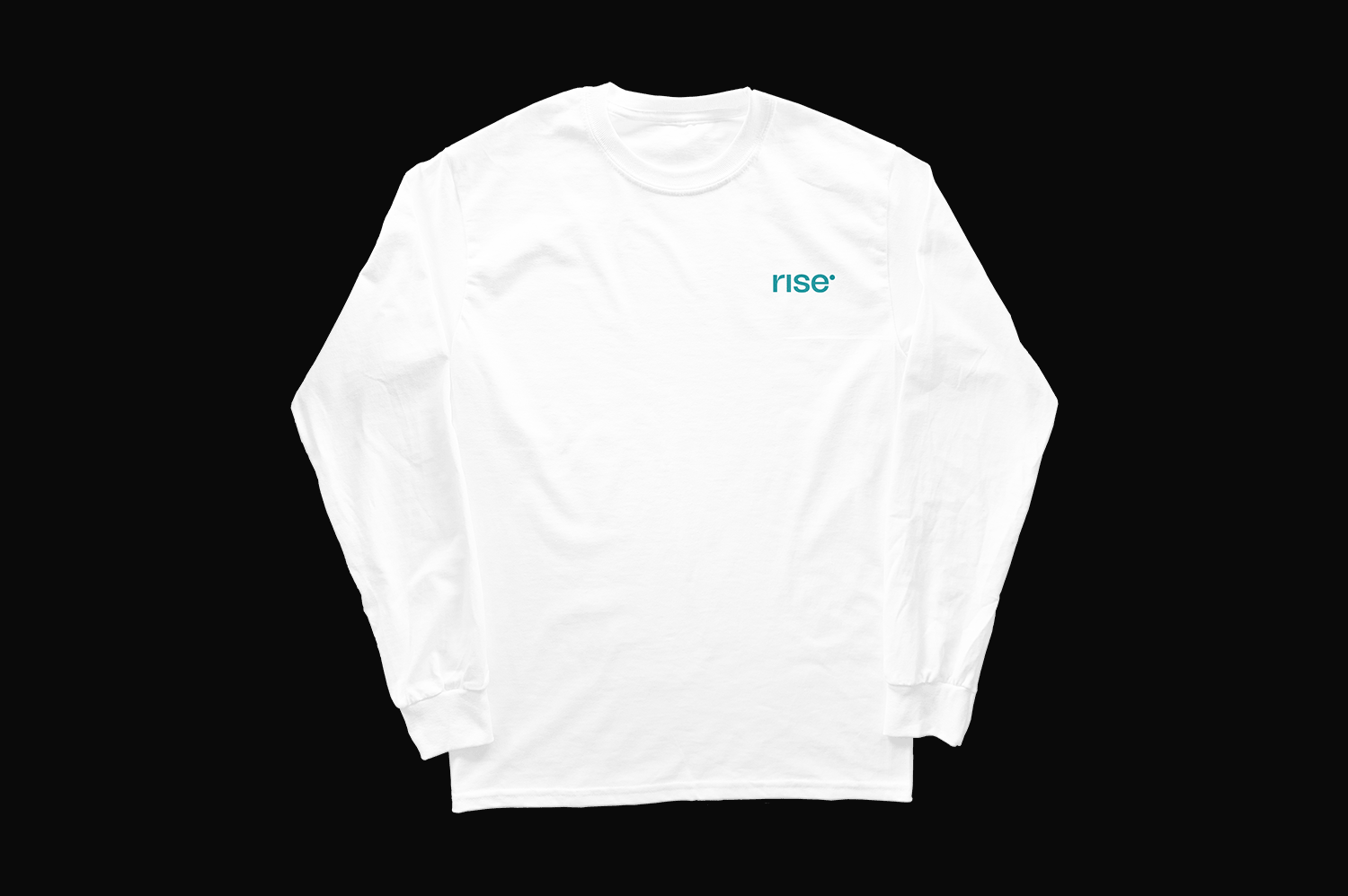
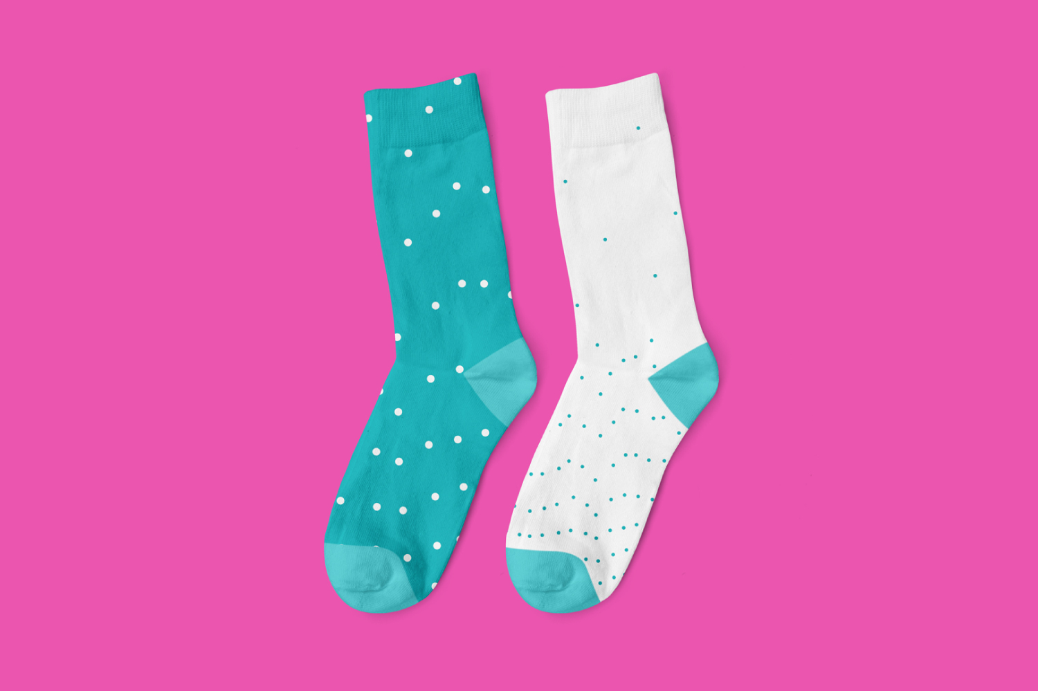
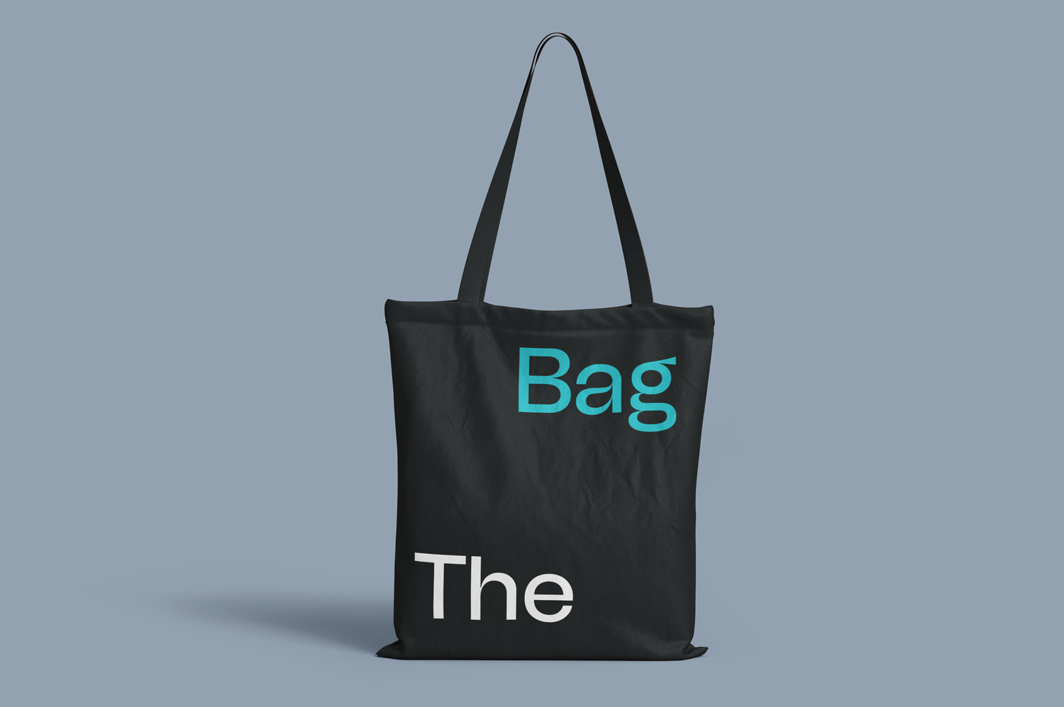
The rising dot is the key visual device and foundation of identity. The idea is that if a full stop, which is typically at the bottom end of a word can rise, then everyone can. It communicates the idea that with Rise, everyone can experience financial growth and upward mobility. The behaviour of the dot is constant throughout the identity, extending into other visual devices like colour, patterns, illustrative style, and even copy. Considering this was a brand refresh, some visual devices from the previous identity were strategically retained for a smooth transition into the new. The primary colour was retained but accompanied by a handful of new vibrant colours. We developed a new gradated language for the colours to link the old gradient to the new identity.
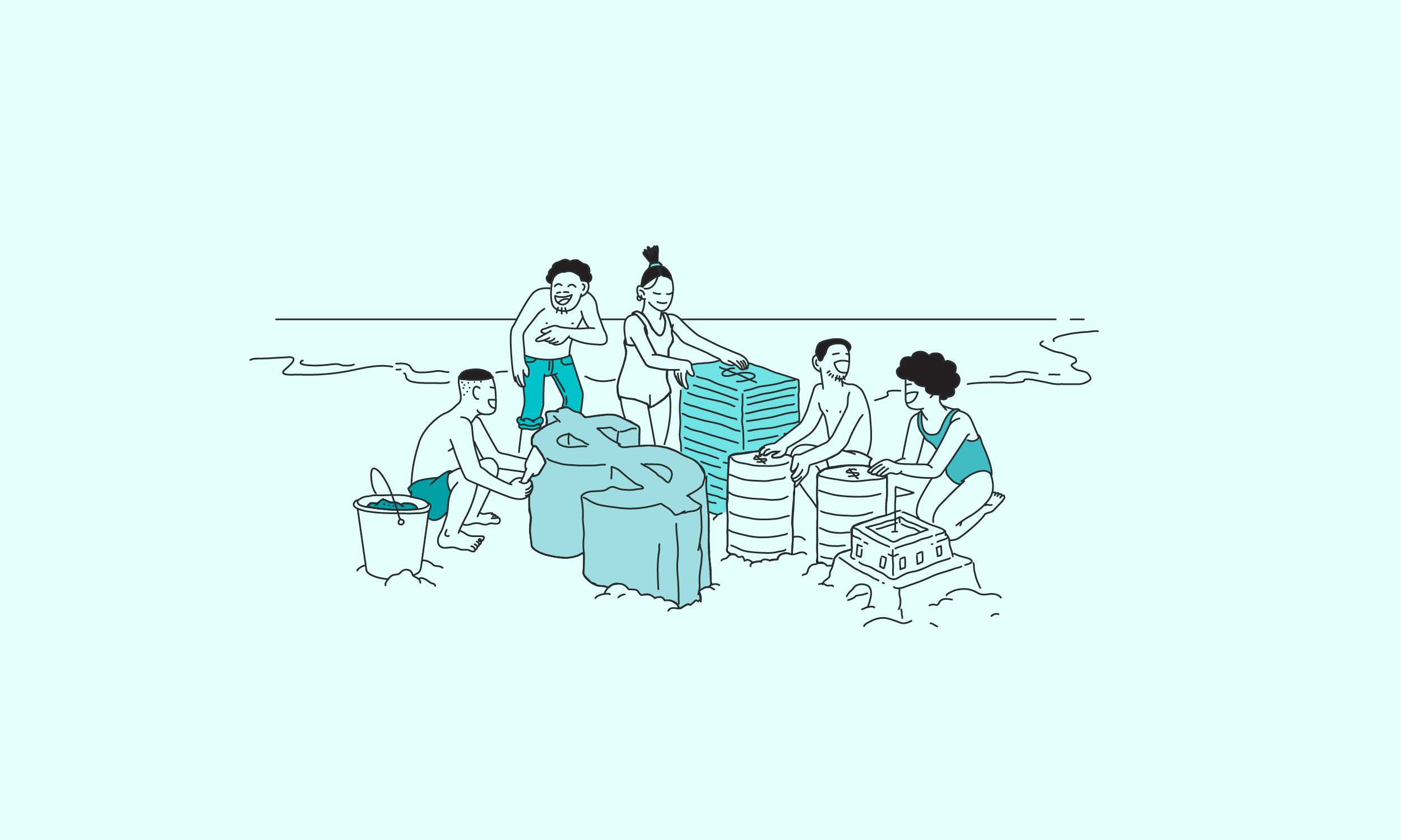
The new identity embodies Rise’s commitment to helping its customers build, grow and rise financially.
Rise wants everyone, regardless of social or financial status, to have access to dollar investments that will enable them to grow financially. Rise professionally manages its users' investments by providing investment options for different risk appetites. With users being able to start investing with as little as $10, Rise is on its way to becoming a hedge fund for any and everyone in Africa
.
Considering that inclusion, steady financial growth and a thriving community are essential to Rise. The main design questions were: how do we visually translate all the existing values into an identity that embodies these values? How do we create an identity which communicates that everyone really is welcome?
The rising dot is the key visual device and foundation of identity. The idea is that if a full stop, which is typically at the bottom end of a word can rise, then everyone can. It communicates the idea that with Rise, everyone can experience financial growth and upward mobility. The behaviour of the dot is constant throughout the identity, extending into other visual devices like colour, patterns, illustrative style, and even copy. Considering this was a brand refresh, some visual devices from the previous identity were strategically retained for a smooth transition into the new. The primary colour was retained but accompanied by a handful of new vibrant colours. We developed a new gradated language for the colours to link the old gradient to the new identity.
The new identity embodies Rise’s commitment to helping its customers build, grow and rise financially.
Rise wants everyone, regardless of social or financial status, to have access to dollar investments that will enable them to grow financially. Rise professionally manages its users' investments by providing investment options for different risk appetites. With users being able to start investing with as little as $10, Rise is on its way to becoming a hedge fund for any and everyone in Africa.
Considering that inclusion, steady financial growth and a thriving community are essential to Rise. The main design questions were: how do we visually translate all the existing values into an identity that embodies these values? How do we create an identity which communicates that everyone really is welcome?
The rising dot is the key visual device and foundation of identity. The idea is that if a full stop, which is typically at the bottom end of a word can rise, then everyone can. It communicates the idea that with Rise, everyone can experience financial growth and upward mobility. The behaviour of the dot is constant throughout the identity, extending into other visual devices like colour, patterns, illustrative style, and even copy. Considering this was a brand refresh, some visual devices from the previous identity were strategically retained for a smooth transition into the new. The primary colour was retained but accompanied by a handful of new vibrant colours. We developed a new gradated language for the colours to link the old gradient to the new identity.
The new identity embodies Rise’s commitment to helping its customers build, grow and rise financially.