Wellsprings is a safe, peaceful, efficient, and calm haven within the bustling, active city of Ibadan. The goal was to create a brand identity that embodies the serenity and wholesomeness living in Wellsprings brings. A wellspring is an abundant source of something. In the case of this estate, it’s a source of wellness for its inhabitants. It’s a source of inspiration saying a new standard of living is possible. The identity is anchored around this idea of origination and a bountiful source, reflecting that a great life will emanate from a great home.
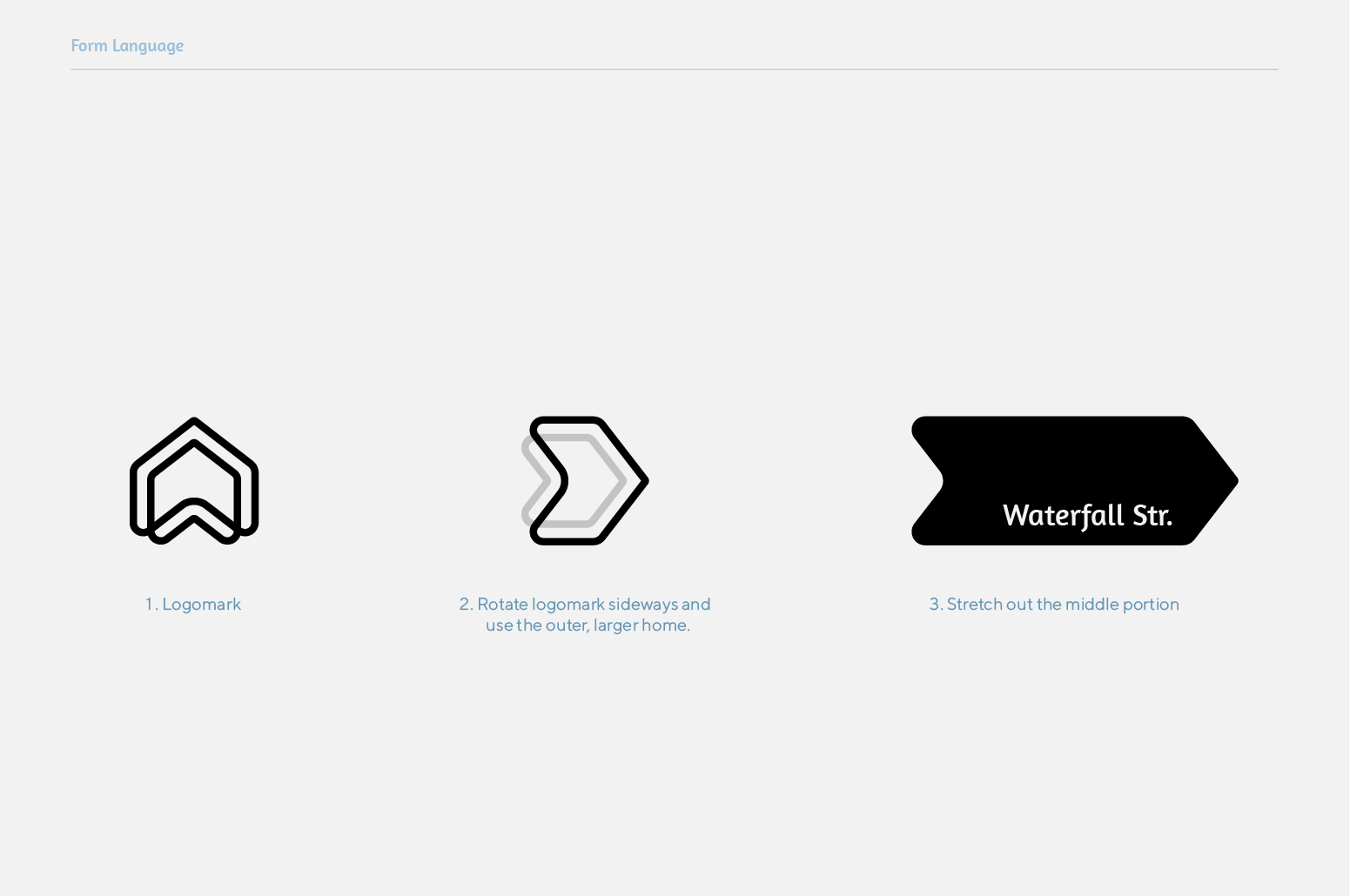
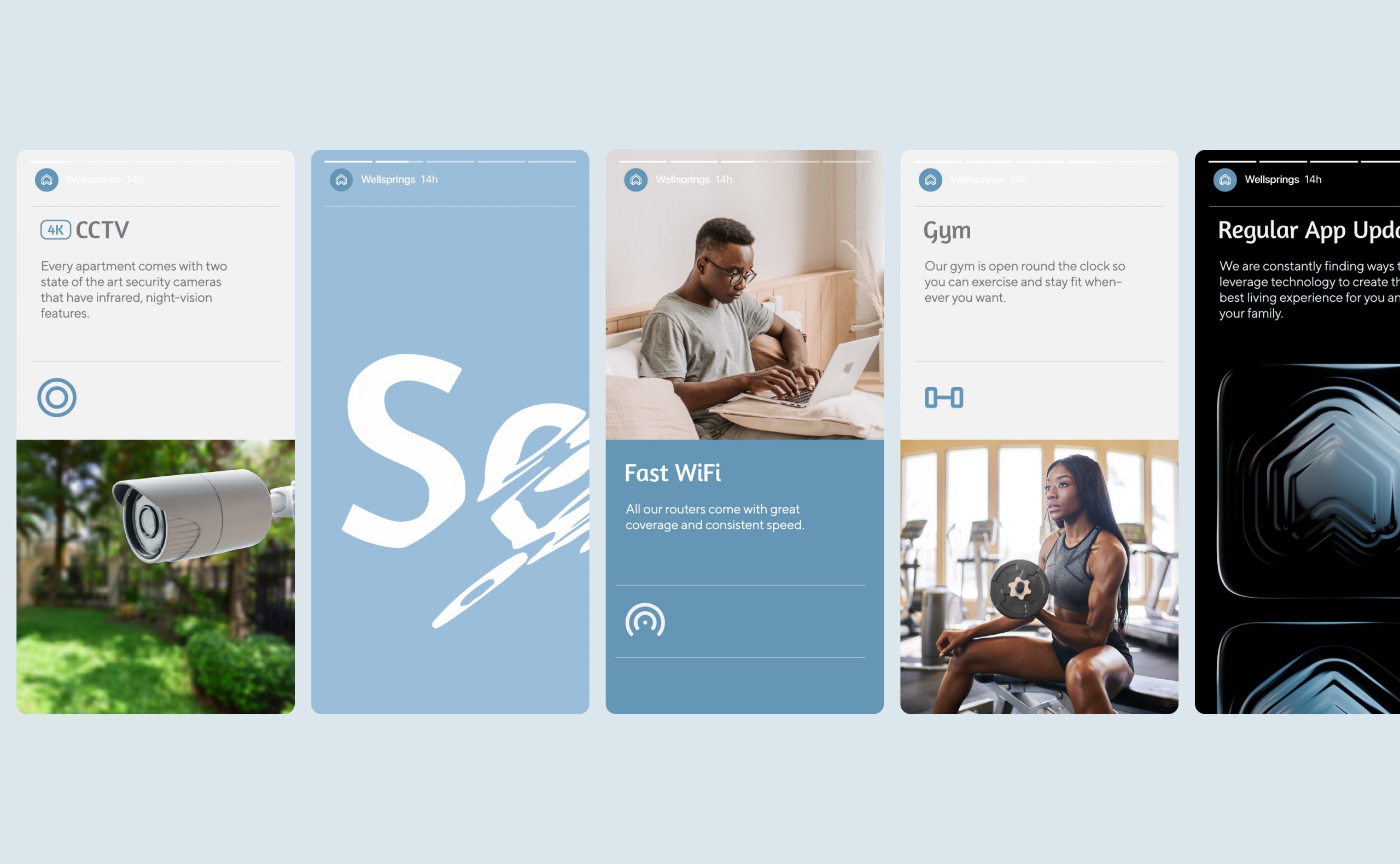
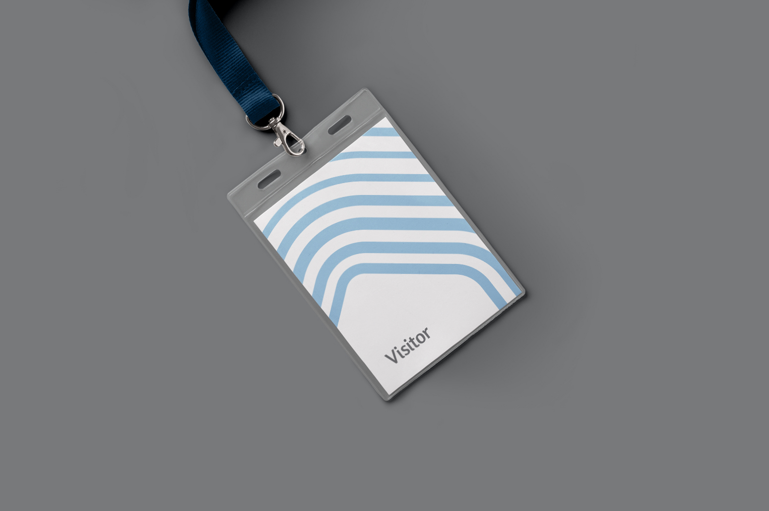
The origination and source idea starts with the Logomark. It is the starting point of the core visual device: the rippling. It’s form takes on the basic shape of a house, with the base pushed upwards from the centre, forming a “W” for Wellsprings. Its distinctive double-line work begins the rippling present throughout the identity.
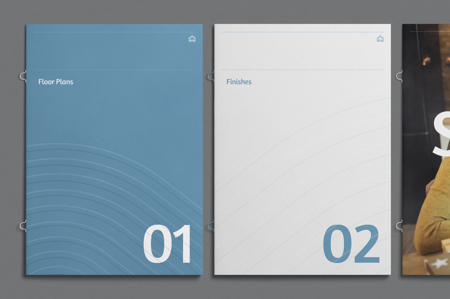
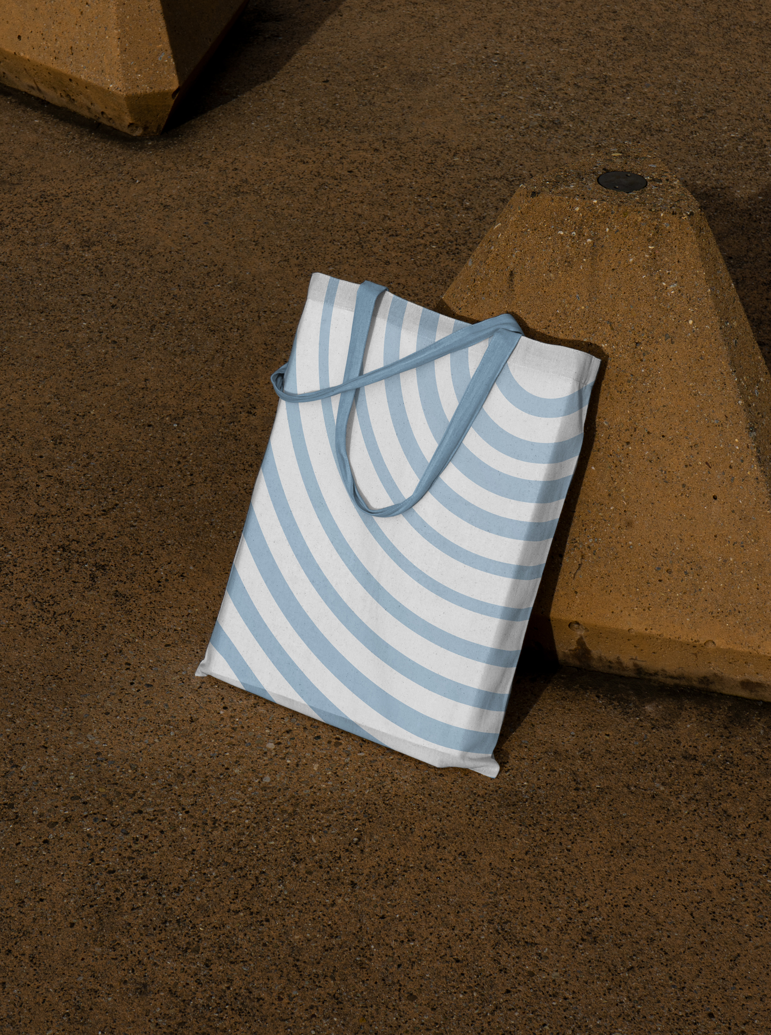
The abundance and soothing nature of the sky and water inspired the colours and gradient. Like a pebble thrown in a pond, the rippling reflects the effect Wellsprings will have on its inhabitants and the city. Together with the varying sizes of its lines, they emanate a soothing calm.
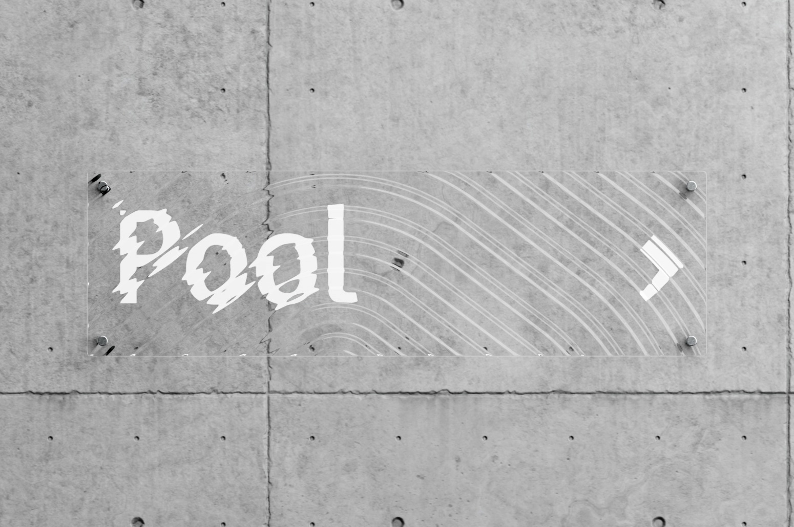
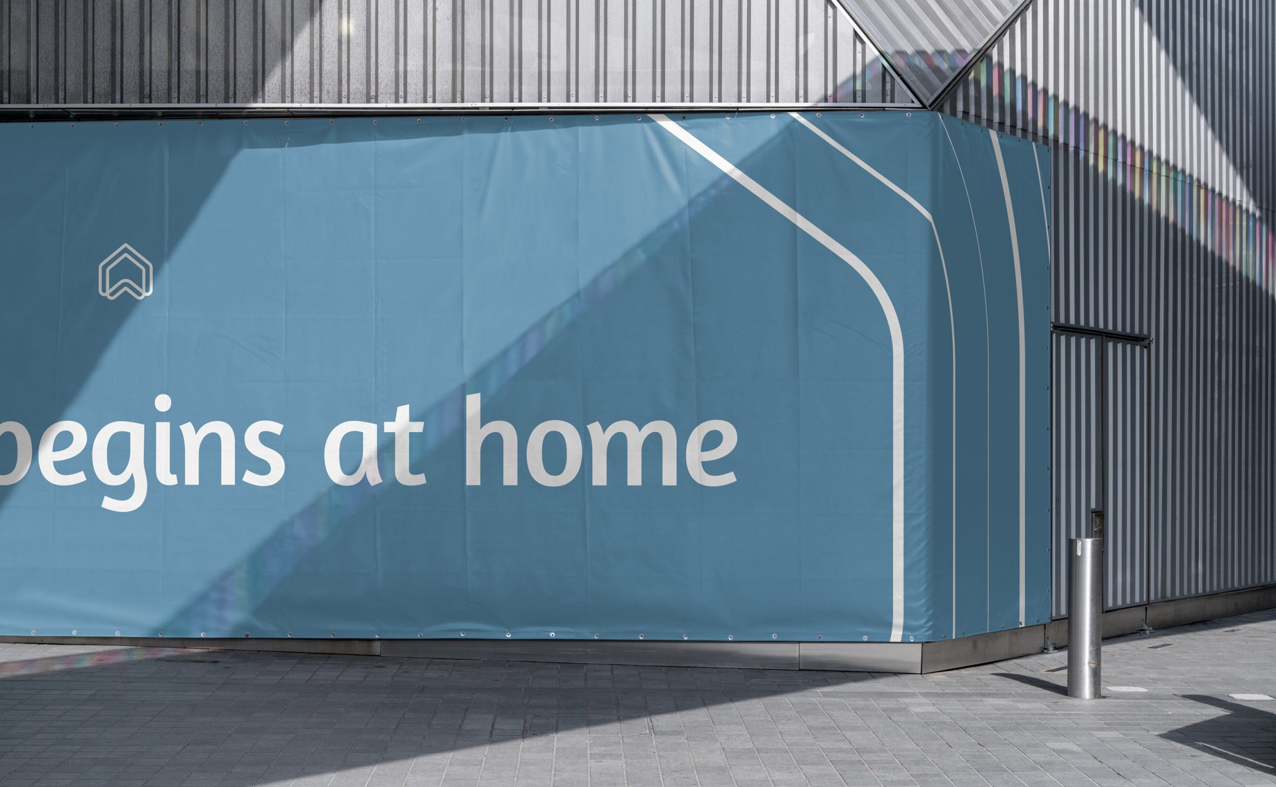
The verbal identity brings everything full circle. It emphasises the ripple effect of a great home, directly leaning into the idea that so much of a good life begins at home.
Wellsprings is a safe, peaceful, efficient, and calm haven within the bustling, active city of Ibadan. The goal was to create a brand identity that embodies the serenity and wholesomeness living in Wellsprings brings. A wellspring is an abundant source of something. In the case of this estate, it’s a source of wellness for its inhabitants. It’s a source of inspiration saying a new standard of living is possible. The identity is anchored around this idea of origination and a bountiful source, reflecting that a great life will emanate from a great home.
The origination and source idea starts with the Logomark. It is the starting point of the core visual device: the rippling. It’s form takes on the basic shape of a house, with the base pushed upwards from the centre, forming a “W” for Wellsprings. Its distinctive double-line work begins the rippling present throughout the identity.
The abundance and soothing nature of the sky and water inspired the colours and gradient. Like a pebble thrown in a pond, the rippling reflects the effect Wellsprings will have on its inhabitants and the city. Together with the varying sizes of its lines, they emanate a soothing calm.
The verbal identity brings everything full circle. It emphasises the ripple effect of a great home, directly leaning into the idea that so much of a good life begins at home.
Wellsprings is a safe, peaceful, efficient, and calm haven within the bustling, active city of Ibadan. The goal was to create a brand identity that embodies the serenity and wholesomeness living in Wellsprings brings. A wellspring is an abundant source of something. In the case of this estate, it’s a source of wellness for its inhabitants. It’s a source of inspiration saying a new standard of living is possible. The identity is anchored around this idea of origination and a bountiful source, reflecting that a great life will emanate from a great home.
The origination and source idea starts with the Logomark. It is the starting point of the core visual device: the rippling. It’s form takes on the basic shape of a house, with the base pushed upwards from the centre, forming a “W” for Wellsprings. Its distinctive double-line work begins the rippling present throughout the identity.
The abundance and soothing nature of the sky and water inspired the colours and gradients. Like a pebble thrown in a pond, the rippling reflects the effect Wellsprings will have on its inhabitants and the city. Together with the varying sizes of its lines, they emanate a soothing calm.
The verbal identity brings everything full circle. It emphasises the ripple effect of a great home, directly leaning into the idea that so much of a good life begins at home.